Crafting a Brand Design Consistency Playbook: Your Guide to Visual Cohesion

Introduction
Design consistency is not just a visual luxury—it’s a strategic imperative. In today’s saturated digital ecosystem, users encounter countless brands across a myriad of platforms. What makes one stand out isn’t simply a bold logo or a vibrant color palette, but the consistent application of visual, interactive, and verbal elements that create a cohesive experience. This is where Visual Branding & Design plays a pivotal role—not just in creating appealing aesthetics but in orchestrating trust, memory recall, and identity across every user touchpoint.
Design consistency cultivates trust, enhances usability, and reinforces brand recognition. Whether it’s the layout of an app, the tone of a customer email, or the packaging of a product, brands that unify these details signal reliability and professionalism. According to research from Lucidpress, consistent branding can increase revenue by up to 33%, underscoring its powerful impact on both user experience and business outcomes.
From startup landing pages to enterprise SaaS dashboards, every touchpoint contributes to a brand’s visual narrative. Visual Branding & Design ensures this narrative is cohesive—using consistent colors, typography, and iconography—not just for aesthetics, but to create emotional familiarity. When users encounter a unified brand experience—whether on mobile apps, websites, packaging, or even in-store signage—they feel oriented, assured, and confident. This reduces cognitive friction, increases engagement, and builds lasting brand loyalty.
A consistent Visual Branding & Design strategy also enhances internal clarity. Teams across design, marketing, and product development align better when brand assets and messaging follow a shared playbook. It eliminates guesswork, accelerates creative workflows, and ensures that even outsourced or distributed teams maintain the brand’s voice and look.
In an era where attention spans are shrinking and competition is exploding, visual consistency is a silent but powerful differentiator. It is not just about being remembered—it’s about being trusted and chosen.
What Is a Design Consistency Playbook?
A Design Consistency Playbook is a strategic framework that ensures the uniform application of design principles and brand assets across all touchpoints—digital, physical, and experiential. It’s the blueprint that governs how your brand “shows up” in the world, visually and verbally, ensuring every element feels like it comes from a single source of truth.
At its core, design consistency means applying visual elements—color palettes, typography, iconography, layouts, and tone of voice—in a way that’s repeatable and predictable. But this playbook goes beyond aesthetics. It’s about building a cohesive user journey that feels intuitive, familiar, and aligned with the brand’s values and personality.
Whether a user interacts with your mobile app, receives a marketing email, or visits your physical store, the experience should feel connected. These consistent brand signals build subconscious associations that fuel brand recall, increase user trust, and reinforce your positioning. Especially in ecommerce and SaaS environments, these visual cues serve as silent trust builders, helping users complete tasks quickly without hesitation.
Consistency is also crucial for accessibility. When buttons, navigation, and interaction cues appear in predictable places, users—especially those with cognitive or visual challenges—experience fewer obstacles. In this sense, the Design Consistency Playbook is both a brand alignment tool and a user experience enhancer.
Visual, Functional, and Brand-Level Consistency
A solid Visual Branding & Design system addresses three distinct but interconnected layers of consistency:
- Visual Consistency
This includes colors, typefaces, icon styles, spacing, and layout grids. For instance, a product landing page, mobile screen, and Instagram ad should all reflect the same visual brand identity. Maintaining UI element harmony ensures the brand looks and feels stable across environments. - Functional Consistency
This refers to interface behavior—such as always placing the checkout button in the bottom right or maintaining the same hover effects across call-to-actions. UX consistency principles reduce learning curves, improve task flow, and decrease user frustration. - Brand-Level Consistency
This level governs messaging alignment, tone of voice, visual metaphors, and personality across departments like marketing, customer service, and product. A unified brand consistency framework ensures your brand doesn’t just look the same—it feels the same, whether you’re chatting with support or reading a press release.
Together, these three dimensions unify the brand experience. They transform a collection of assets into a cohesive brand narrative, ensuring that regardless of platform, campaign, or interaction point, the user feels they’re engaging with a single, trustworthy entity.
Internal vs External Consistency Playbook: What’s the Difference?
While design consistency may seem like a singular concept, it’s actually divided into two crucial pillars: internal consistency and external consistency. Both are essential for crafting a seamless Visual Branding & Design strategy and ensuring users feel confident at every brand touchpoint.
Internal Consistency
Internal consistency refers to the visual and functional coherence within a single product or digital experience. For example, if your mobile app uses rounded buttons with a specific hover effect, those same styles should appear across the home screen, checkout process, settings, and notifications. This level of consistency ensures users don’t have to relearn behavior, improving accessibility and reducing cognitive load.
Maintaining internal design uniformity is also about typography, color usage, grid systems, and interaction patterns. Every micro-interaction—from the way a form field validates to the animation of a loading spinner—should reflect a common logic. This is especially critical in SaaS products, mobile apps, and eCommerce platforms where rapid task completion is essential.
External Consistency
External consistency extends this principle across multiple platforms, products, and marketing channels. Your brand’s identity should remain unmistakably familiar whether a user interacts with a printed brochure, mobile app, website, email campaign, or physical product packaging. This is where cross-platform UI consistency and brand identity systems become indispensable.
This kind of consistency is maintained by aligning brand behaviors across disciplines—so the tone used in your social media matches the tone in your app notifications, or your website design reflects the same design language as your sales presentations.
Micro vs Macro Design Governance
To achieve both internal and external consistency, your design playbook must operate at both micro and macro levels:
- Micro Governance: This involves the tactical enforcement of rules—ensuring iconography, spacing, typography scales, and component behavior are identical across screens. This is where UI design tokens and reusable components in design systems come into play.
- Macro Governance: At the strategic level, macro consistency is about brand-wide cohesion. It requires collaboration between design, marketing, development, and leadership teams to maintain a consistent brand narrative and Visual Branding & Design system. Shared rituals such as brand audits, team onboarding, and cross-functional reviews keep everyone on the same page.
Real-World Anecdote
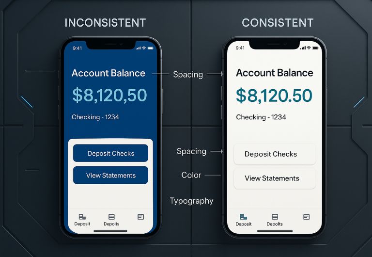
At a mid-sized ecommerce startup, the marketing team used pastel pink as the primary brand accent, while the product design team unknowingly favored teal. Because the teams lacked a unified style guide and didn’t use a shared design system, users experienced a visual disconnect. Landing on the homepage from a Facebook ad, visitors would feel confused—was this the same company? That single lapse in visual cohesion led to a 12% bounce rate spike. Over time, the lack of trust manifested in declining engagement and customer churn.
Why Is Design Consistency Crucial for Brand Success?
Trust and Credibility
Imagine visiting a banking site and noticing inconsistent colors, fonts, and layouts on every page. You’d likely question its legitimacy. Consistency signals professionalism and reliability. According to Playbook.com, “Brand guidelines are the rules that your brand’s personality is based on; they codify how the various parts of your brand ‘behave’ when they interact with humans.”
Usability and Familiarity
Consistent design reduces cognitive load. Users become familiar with patterns, making navigation easier. This is especially important in mobile apps and ecommerce, where efficiency drives conversions.
Brand Recognition
Top brands like Apple and Louis Vuitton maintain visual and interactional consistency across retail, digital, and packaging. Every detail—from microcopy to font size—adheres to a codified design language.
Professionalism and Perception
Minor inconsistencies—like uneven spacing or color mismatch—can feel unprofessional. As Playbook.com notes, “Sweat the details… even sizing and spacing impact recognition.” In ecommerce, a mismatched CTA button can reduce user trust and deter purchases.
The Consistency Playbook Framework: Building a Unified System
Achieving and maintaining design consistency is not a one-time checkbox—it’s an ongoing, evolving process that involves people, tools, governance, and strategy. A well-structured Design Consistency Playbook acts as a living document that adapts as your brand matures, your product offerings grow, and your user expectations evolve.
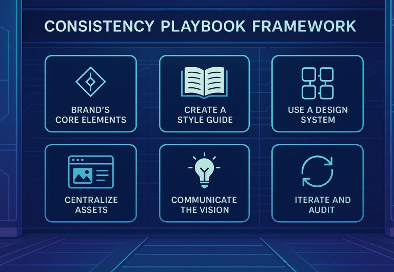
Below is a six-step framework that forms the foundation of a scalable, resilient, and cohesive Visual Branding & Design system:
1. Define Your Brand’s Core Elements
Start by identifying and documenting the building blocks of your brand identity. This includes:
- Color palette with HEX/RGB/CMYK values
- Primary and secondary typography
- Logo usage rules (clear space, sizing, variants)
- Voice and tone guidelines for different channels (web, social, support)
These components become the DNA of your visual identity system. Codifying them into a centralized document ensures that anyone—internal teams, agencies, freelancers—has immediate access to what defines your brand.
2. Create a Style Guide
A style guide functions as the brand’s rulebook. But it’s more than just a PDF with logo specs—it’s a living, breathing style governance system. Break it into two core parts:
- Visual guidelines: Layout, spacing rules, image treatment, icon style, grid systems.
- Editorial guidelines: Voice, grammar rules, tone for different touchpoints (e.g., casual on social, authoritative in whitepapers).
A great style guide system promotes both clarity and creativity. It prevents ad hoc design decisions that dilute your branding.
3. Use a Design System
Unlike a static style guide, a design system is dynamic and built for design at scale. It includes:
- Reusable UI components (buttons, navs, modals, input fields)
- Interaction patterns and accessibility behavior
- Tokens for spacing, shadows, radius, colors
Use platforms like Figma, Storybook, Adobe XD, or Zeroheight to document and distribute your design system. This eliminates the guesswork from cross-functional collaboration and speeds up design-to-development handoff.
4. Centralize Assets
Dispersed assets = inconsistent branding. Centralization is a must for asset governance.
Implement a Digital Asset Management (DAM) system—like Bynder, Frontify, or Lucidpress—to store brand assets, marketing templates, sales decks, and more. Ensure it supports tagging, version control, user permissions, and integration with design tools.
This allows for version integrity, asset discoverability, and brand-wide consistency—especially crucial in remote or fast-scaling teams.
5. Communicate the Vision
Even the best-designed systems fail without human alignment. Consistency begins with team buy-in.
Onboard every new hire with your design playbook. Host quarterly alignment sessions. Create rituals like brand review meetings or design QA walkthroughs to reinforce shared understanding.
Use collaborative frameworks like The Team Canvas to establish team roles, values, and goals. This builds cross-departmental trust and accountability.
6. Iterate and Audit
Consistency is not static—it evolves. Schedule regular brand audits to identify visual drift, outdated assets, or tone inconsistencies.
Establish KPIs like brand recall, conversion rate consistency, or user trust indicators. Use tools like Hotjar, FullStory, or Google Analytics to evaluate experience alignment.
Create a design QA checklist to review deliverables before launch, ensuring fidelity to the playbook. Assign brand stewards or a design ops lead to oversee execution across departments.
Case Studies: Brands That Nail Design Consistency
When it comes to design consistency, some brands don’t just follow guidelines—they set the global standard. Let’s look at a few companies that exemplify how a Design Consistency Playbook can transform brand equity, user loyalty, and creative execution at scale.
Apple
Apple is often hailed as the gold standard for design consistency in technology. Every interaction—from walking into an Apple Store to using a MacBook or unboxing AirPods—follows a meticulously unified experience. Their typography, spacing, button behaviors, iconography, and even product naming follow strict design systems.
What sets Apple apart is their obsession with micro-consistency: even their microcopy (like button text or system alerts) follows an intentional, human-first tone. This creates emotional coherence in addition to visual polish. Whether you’re watching a product keynote or browsing Apple’s website, the experience feels unmistakably “Apple”—refined, restrained, and premium. This cross-platform unity builds deep brand trust and long-term user loyalty.
Coca-Cola
With a presence in over 200 countries, Coca-Cola is a masterclass in maintaining global brand consistency while allowing for local cultural relevance. Their signature red hue, classic Spencerian script logo, and uniquely contoured bottle shape have remained core visual elements for over a century.
Yet Coca-Cola doesn’t let consistency make them static. They adapt messaging and visuals for regional campaigns without compromising core identity. This balance is achieved through a well-documented brand identity system that includes templates, usage rules, and brand storytelling frameworks. It’s not just about repeating elements—it’s about reinforcing emotional familiarity across diverse markets.
Spotify Design Principles
Spotify doesn’t just use design systems—they share their design philosophy publicly, reinforcing transparency and alignment across product and marketing. Their design team has published a robust set of Spotify Design Principles that emphasize clarity, empathy, and cohesion.
These principles guide everything from UI components to playlist cover art to motion design. The result is an experience that feels personalized yet predictably branded—whether you’re using the desktop app, mobile player, or smart TV interface. It’s a great example of how cross-functional design teams can stay aligned through shared vision and language.
Hanno’s Public Design Playbook
Hanno, a digital product studio, showcases what happens when startups take brand transparency seriously. Instead of keeping brand guidelines behind internal firewalls, Hanno publicly shares its Design Playbook—a detailed breakdown of its visual system, brand voice, accessibility rules, and UI patterns.
This public-facing approach has two major benefits: it holds the company accountable to high design standards and inspires other startups to elevate their branding practices. Hanno’s playbook is now widely referenced by designers and founders alike looking to establish consistent visual systems early in their product’s lifecycle.
Conclusion
Design consistency isn’t a nice-to-have—it’s a business-critical strategy that shapes how users perceive, trust, and engage with a brand. In an increasingly fragmented digital landscape, brands that present a unified identity across every channel—product, marketing, support, and packaging—build not just recognition, but emotional credibility. Whether it’s internal alignment through reusable UI components or external harmony across platforms, consistency simplifies experiences and amplifies brand loyalty.
A well-structured Design Consistency Playbook is your compass in this journey. It connects the dots between creative expression and operational discipline, between what looks beautiful and what performs reliably. When design teams, developers, marketers, and executives operate from the same visual and verbal standards, creativity doesn’t get limited—it flourishes within a shared framework. This is how brands like Apple, Spotify, and Coca-Cola deliver clarity at scale.
Consistency isn’t about rigidity—it’s about intentional repetition with purpose. The goal is not sameness, but coherence. In a world where trust is currency and attention is fleeting, consistency might just be your most underutilized superpower.
FAQ
1. What is design consistency in UX/UI?
Design consistency in UX/UI refers to the strategic reuse of interface elements—such as buttons, icons, color schemes, and typography—across all screens and interactions. It ensures that users can predict behavior, understand layout logic, and navigate intuitively. By maintaining visual and functional coherence, brands enhance usability and reduce cognitive load. This predictability boosts user confidence and retention. Consistency becomes the foundation for seamless, user-centered design systems.
2. How do internal and external design consistency differ?
Internal consistency governs how visual and interaction elements function within a single product, like ensuring all buttons follow the same style across an app. External consistency expands this to ensure alignment across multiple brand platforms—websites, mobile apps, packaging, and advertising. Both types are vital for user trust and brand recognition. Internal design supports learning and usability, while external consistency reinforces a unified brand presence. Together, they shape holistic user experiences.
3. Why is visual consistency important for ecommerce?
In ecommerce, users make rapid decisions based on visual cues. A consistent visual interface—through fonts, colors, product cards, and CTAs—creates familiarity and trust. Disjointed visuals confuse shoppers and can suggest unprofessionalism or even fraud. Cohesive branding reduces friction, improves navigation, and increases purchase confidence. Ultimately, visual consistency boosts conversion rates and customer satisfaction.
4. How do brands like Apple or Coca-Cola maintain consistency?
Leading brands like Apple and Coca-Cola maintain consistency by developing comprehensive brand systems that govern visual, functional, and messaging standards. These systems are documented in style guides and design systems that guide every team—from design to customer support. Regular brand audits ensure alignment and eliminate drift. Every detail, from tone to typography, is intentional. This disciplined governance fuels global brand recognition and trust.