The Language of Brand Motion: Conveying Stories Through Movement

Introduction
Brand Motion Language represents the evolving language of visual storytelling where movement speaks as powerfully as typography, color, or sound. As design becomes increasingly multisensory and immersive, motion is no longer a decorative flourish it’s a foundational element of Visual Branding & Design. More than just a trend, it’s a shift in how we communicate and connect through digital interfaces.
In today’s saturated content environments, static visuals often fall short. Movement, when used purposefully, captures attention in milliseconds and guides users through complex narratives with emotional precision. Scientific research from institutions like the MIT Media Lab confirms that motion doesn’t merely decorate an interface, it plays a vital role in how users process information. Studies reveal that motion enhances both comprehension and retention, especially in mobile-first and interaction-heavy environments.
Brands are now leveraging motion as a strategic tool to shape perception, build emotional resonance, and create intuitive digital experiences. This is particularly crucial in an age where microinteractions, hover states, and transitions make up a significant portion of the user experience.
This article introduces Brand Motion Language as a linguistic framework, structured around core principles such as speed, easing, direction, and delay each carrying intention and brand expression. Drawing on industry-leading insights from Greenhouse’s motion system, Google’s Material Motion guidelines, and case studies in cutting-edge brand ecosystems, we address one of the most common pain points in design systems today: how to move beyond scattered animations to a consistent, intentional, and expressive Visual Branding & Design system.
Whether you’re building a design system from scratch or refining motion consistency across products, the concepts in this guide aim to empower your teams to treat motion not as an afterthought but as brand voice in motion.
What Is Brand Motion Language?
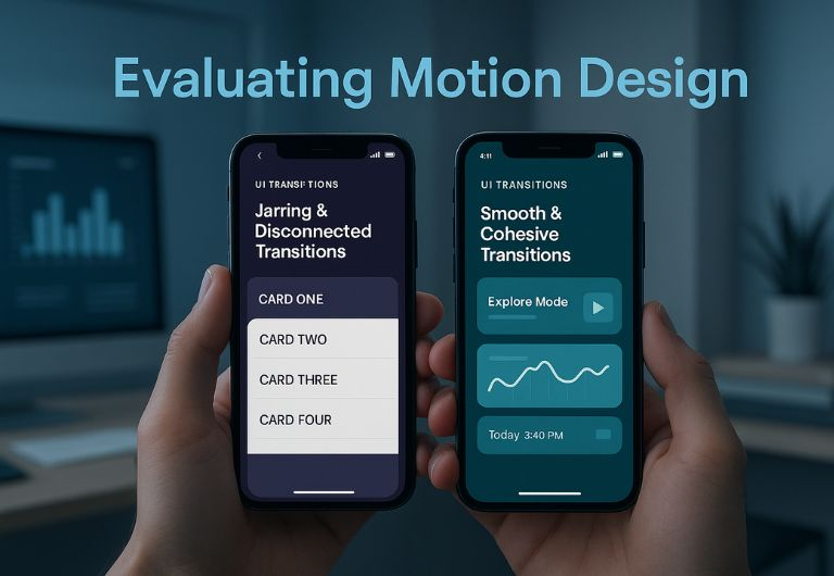
At its core, Brand Motion Language is the set of behavioral principles that guide how a brand “moves” across digital and physical spaces. Much like a brand’s tone of voice or typographic hierarchy, motion elements like speed, rhythm, easing, and direction work together to form a coherent personality in motion. According to Greenhouse, motion in branding isn’t just about aesthetics: “It’s about creating intention through energy, rhythm, and emotion.” Brands use motion language to express themselves more vividly whether it’s the soft ease-in of a health brand or the snappy velocity of a fintech app.
What distinguishes motion language from mere animation is the idea of systems. Rather than treating each movement as a one-off visual, brands build a toolkit: a consistent set of principles that define how they appear in motion across buttons, transitions, videos, and microinteractions. This systemic approach ensures that every movement is in character, just like fonts or color palettes.
Studies show that humans assign emotional qualities to movement. A slow, linear fade may suggest calm or trust, while a fast, bouncing entrance might evoke excitement or playfulness. A systematized motion identity translates these subconscious cues into purposeful communication.
Why Motion Matters in Modern Branding
Motion is hardwired into human cognition. We’re biologically attuned to movement; it grabs our attention faster than static visuals, a trait rooted in our evolutionary need to detect threats or opportunities. In branding, this instinct becomes a powerful asset: motion can elevate user experiences, clarify complex flows, and build emotional bonds.
Motion Strengthens Brand Recognition
In an increasingly digital landscape, where brands are experienced through screens rather than storefronts, motion becomes the glue that binds identity across mediums. Subtle transitions, hover effects, and page transitions allow brands to reinforce their identity every time users interact. According to research by everything.design, brands that implement strategic motion frameworks see a 27% increase in user satisfaction and 18% higher recall rates. The implication is clear: motion doesn’t just support the brand; it enhances it.
From Afterthought to Intentional Design
Yet many teams treat motion as an afterthought adding animations at the end of the design process. This disconnect leads to inconsistency, off-brand experiences, and visual clutter. When motion lacks strategy, it becomes ornamental rather than functional. Teams that prioritize motion early in the design workflow report smoother developer handoffs and more cohesive user experiences. Motion, when rooted in purpose, becomes an extension of the brand itself. It informs, guides, and emotionally resonates.
Storytelling Through Movement
Brands like Google Material Design understand this deeply. Their motion guidelines focus not only on how elements move but why they move. Every acceleration curve or directional shift carries meaning. The speed of a button’s fade, the elasticity of a card’s pop-up, or the pause between transitions are all storytelling moments. A swipe that gently pushes content off-screen communicates subtle continuity, while a snap-back animation can imply error or rejection. These moments mimic real-world physics and narrative flow.
Emotional Resonance and Perception
Motion matters because perception is emotional. We don’t just see motion; we feel it. A quick zoom can build anticipation, while a soft dissolve suggests reflection or closure. These are not just animations, they are emotional cues embedded in the brand experience. Brands that fail to acknowledge this lose opportunities to build empathy and engagement. The language of motion is what makes a brand feel alive, responsive, and trustworthy.
Key Principles of Effective Motion Language
Understanding motion as a language means recognizing its grammar and the consistent set of rules that structure how it is used and perceived. These foundational principles are critical to creating a compelling and coherent brand motion identity.
1. Shape & Direction: Signaling Intent
The path that motion takes its shape and direction signals meaning. For example, motion that flows upward often connotes growth, optimism, and aspiration, while downward or erratic lateral movement may feel negative or abrupt. Greenhouse’s motion identity, modeled after natural plant growth, uses upward, smooth transitions to evoke themes of nurturing and organic development.
Direction also influences interaction design. A swipe-left motion may signal deletion or dismissal; a rightward motion can imply progression or affirmation. These cues are not arbitrary; they’re culturally and cognitively embedded. Maintaining consistency in directional intent ensures that the brand feels intuitive and emotionally attuned.
2. Timing & Duration: Setting the Rhythm
Timing refers to the length of an animation, while duration refers to how long it remains visible or active. Together, they set the rhythm of a brand’s interaction. Too quick, and the motion feels rushed or anxious; too slow, and it creates drag and delays comprehension.
Google’s Material Design recommends timing intervals between 200ms and 500ms fast enough to be responsive, but long enough to be perceived. This principle applies across UI interactions like hover states, modal transitions, and scroll-based reveals. Brands can define tempo like a musical score to align their timing with their voice: upbeat and snappy for playful brands, or smooth and extended for elegant ones.
Good motion timing also reduces cognitive load. Predictable durations allow users to anticipate change and form mental models of interface behavior. This leads to smoother navigation and increased trust.
Anecdote: A UX strategist at an e-commerce brand noted that shortening page transitions by 100ms increased perceived responsiveness, even though total page load time remained unchanged.
3. Easing & Scale: Creating Narrative Cadence
Easing defines how speed changes over time whether a motion starts slow and accelerates (ease-in), slows down at the end (ease-out), or does both (ease-in-out). Easing affects emotional tone: linear easing feels mechanical, while eased curves add warmth and realism.
Scale, on the other hand, adjusts the size of elements to convey importance or action. For example, a button that grows slightly before settling communicates readiness or urgency. A modal that scales from the center draws focus, reinforcing its role in the user journey.
Brands like Mailchimp use expressive easing to convey personality, snappy bounces and elastic entrances reflect their playful tone. More serious brands might prefer subtle, almost imperceptible easing to suggest authority and precision.
Together, easing and scale create visual cadence like beats in a sentence. They guide users through interfaces, emphasizing key moments and allowing micro-pauses for reflection.
Designer Insight: “We realized our CTA buttons felt cheap because they bounced like a game ad. Replacing that bounce with a smooth ease-in transformed the entire user perception.” Global fintech company UI lead
These elements combine to form a grammar of motion. Just as punctuation affects reading cadence, easing and timing control the visual tempo. The consistency of this tempo across a brand system reinforces credibility and trust.
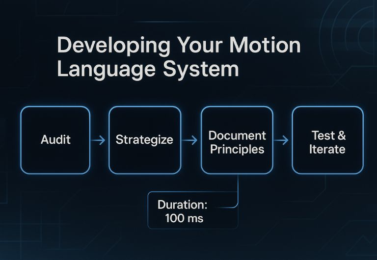
Developing Your Motion Language System
Creating a cohesive motion language isn’t just about animations, it’s about aligning movement with meaning. To build a scalable system, teams must be intentional, collaborative, and iterative. Here’s how to break it down:
1. Audit: Start With Discovery
Review how motion is currently used across your product ecosystem. Capture examples from onboarding flows, transitions, hover states, microinteractions, and hero banners. Look for inconsistencies in speed, direction, or easing. Interview stakeholders designers, engineers, marketing, and users to uncover pain points and opportunities.
Map the journey of motion across platforms (web, mobile, in-app), and identify gaps where the motion either breaks the brand tone or feels out of place. A successful audit sets the foundation for unified motion strategy.
2. Strategize: Define Emotional Intent
Next, connect motion to brand values. If your brand is bold, what does boldness look like in motion? Is it quick, elastic, or linear? If it’s human-centric, does that mean soft easing, gentle transitions, and natural flow?
Build a set of emotional descriptors such as “welcoming,” “confident,” or “playful” and match those to motion behavior. A health app might use “calm” with slow fade-ins; a gaming platform might associate “energy” with snap transitions and springy easing.
Think of this as your emotional blueprint. It ensures your motion isn’t just pretty, it’s purposeful.
3. Document Principles: Codify the Grammar
Motion needs guidelines, just like color or typography. Codify rules for:
- Easing curves: e.g., ease-in-out cubic bezier for default UI
- Speed ranges: e.g., 250–400ms for transitions
- Directional flow: e.g., modals slide up from bottom
- Layer hierarchy: e.g., important elements animate before background
Document these as part of your design system. Create diagrams, timelines, and even motion “do’s and don’ts.” Use tools like Figma’s Smart Animate or Zeroheight to visualize and share motion rules across teams.
4. Build a Toolkit: Equip Designers & Developers
Convert your principles into practical tools. Create:
- Animation presets in After Effects
- Code snippets (e.g., CSS keyframes, React motion variants)
- Motion component libraries in Storybook
- Interactive prototyping libraries (Framer, Lottie)
Make it easy for anyone on the team to apply motion without reinventing the wheel. The toolkit should reflect your brand’s unique rhythm.
5. Test & Iterate: Validate in the Real World
No motion language is perfect out of the gate. Conduct usability testing to gauge user reactions. Use A/B tests to measure how motion affects task completion, engagement, and satisfaction.
Pay attention to accessibility. Ensure animations follow WCAG guidelines, avoid flashing content, provide reduced-motion options, and maintain clarity for neurodiverse users.
What works beautifully in a desktop browser may lag on low-end mobile or feel awkward in AR/VR contexts. Testing ensures resilience.
Follow models like Google Material Motion or Greenhouse, where principles are deeply tied to brand essence. MIT Media Lab’s studies emphasize how users form subconscious judgments about motion within 0.4 seconds leaving little room for ambiguity.
Documenting a motion system prevents brand drift and empowers teams. It bridges gaps between designers and developers while maintaining intent.
Real‑World Examples & Inspirational Case Studies
Greenhouse: Their motion system uses metaphors like “plant-like growth” to guide easing and direction. Transitions feel natural and uplifting, each animation reinforcing their identity as a nurturing, people-first brand.
Google Material Design: Focused on physics-based motion, this system emphasizes realism and predictability. It removes guesswork and provides developers with precise specs.
Mailchimp: A brand known for playful expression uses motion that feels cheeky and human bounces, winks, and snappy transitions.
Anecdote: One UI director recalled how switching from linear movement to eased motion in their onboarding screens dropped bounce rate by 14%. “The change was subtle, but it gave users breathing room to understand what was happening.”
Embedding Motion in the Brand Ecosystem
Embedding motion within a brand’s ecosystem requires both strategic clarity and operational execution. It’s not enough to design beautiful motion; those principles must scale across teams, touchpoints, and timelines.
Motion as Part of Brand Governance
Consistency is key. Just as brands guard their logos and typography, motion must be protected as part of design governance. Create onboarding material that introduces motion as a core pillar of the brand identity, not just a UI flourish.
Embed motion tokens, usage rules, and design rationale into your brand guidelines. Update them regularly, and ensure alignment with accessibility standards and evolving UX best practices. Make these assets accessible to everyone from junior designers to external vendors.
Distribution Across Teams
Motion guidelines should live in design systems tools like Figma, Lottie, or Storybook. House animation tokens alongside typography, spacing, and color variables. Encourage reuse by making templates, snippets, and libraries available via internal wikis or Git repositories.
Integrate motion into handoff pipelines with tools like Zeplin or Zeroheight, where developers can copy specs and animations directly into codebases. This operationalizes consistency and reduces friction.
Empowered Creativity Within Frameworks
Effective motion systems don’t restrict creativity, they focus it. Provide teams with “sandbox” environments where they can experiment with motion variations within the constraints of the brand grammar. Encourage internal motion hackathons or demos.
For example, allow marketing teams more elasticity with motion tempo, while product teams adhere to stricter interaction flows. When guardrails are clear, teams innovate confidently.
Cross-functional Alignment
Agencies, product managers, marketers, and developers must speak the same language. A unified motion language ensures that brand expression remains consistent across advertising, UI, video, and social content. Misalignment is costly not just visually, but in lost trust and fractured experiences.
Run workshops to align on motion principles. Create a motion ambassador group inside your company, a rotating team of designers and developers who champion motion consistency.
Checklist Before Deployment:
- Is the motion consistent with the brand’s emotional tone?
- Does it reinforce the user’s task or distract from it?
- Is it performant across devices and platforms?
- Have accessibility standards (e.g., prefers-reduced-motion) been respected?
- Is documentation available for other teams?
Conclusion
Motion isn’t just animation, it’s brand grammar in motion. When used purposefully, it becomes a bridge between design and experience, emotion and function. Motion transforms static brands into dynamic visual identities, infusing every user interaction with emotional context and narrative rhythm. As digital interfaces evolve, so too must the Visual Branding & Design strategies behind them.
Brands that treat motion with the same rigor as typography, voice, and layout create richer, more engaging ecosystems. The true fluency in motion comes not from flashy animations but from subtle consistency from onboarding screens to loading spinners, from microinteractions to marketing reels.
From foundational principles to reusable toolkits, real-world examples to scalable onboarding, the language of motion is evolving. The brands fluent in this language will define the next generation of Visual Branding & Design, leading with clarity, emotion, and innovation across every screen and platform.
FAQ
1. What is motion branding and why is it essential?
Motion branding uses movement as a core expression of identity. It’s not fluff—it guides attention, expresses emotion, and builds coherence across touchpoints. Think of it as visual tone of voice: just as typography can feel formal or playful, motion can feel energetic or calm. According to one Redditor, “our app felt sarcastic until we slowed things down”. Motion branding transforms static identity into dynamic engagement.
2. How do I make sure motion feels “on-brand”?
Start with defining emotional intent. What energy, rhythm, and character does your brand convey—playful, calm, bold? Then, match motion parameters like easing, timing, and direction to these traits. Purposeful movement ensures coherence across experiences. Aligning motion with brand personality avoids inconsistencies that confuse or frustrate users. Document these decisions so everyone designs with the same playbook.
3. What should a motion identity toolkit include?
A solid toolkit equips teams to execute motion consistently. It should include easing curves, speed maps, directional rules, reusable animation templates, and component-based motion tokens. Platforms like LottieFiles help manage assets across platforms. Add real examples to show do’s and don’ts, and consider prototyping libraries for faster iteration. A well-built toolkit turns motion into a shared language.
4.Can a brand reuse motion across different platforms consistently?
Yes—when supported by documentation and motion tokens. Whether on mobile apps, web, social content, or even AR interfaces, brands can echo a cohesive motion identity. By defining motion properties as variables, you ensure reusability. This consistency builds recognition and trust. From app buttons to hero animations, motion becomes your brand’s kinetic signature.
5. How do easing and timing influence perception?
Easing and timing are emotional levers. Linear easing feels mechanical, while ease-in-out suggests elegance and fluidity. Bouncy easing adds energy but can feel immature if overused. Timing determines clarity—too fast feels abrupt; too slow feels sluggish. Together, easing and timing create visual tempo, guiding attention and delivering emotion at just the right beat.