Color Psychology in Marketing: How Brands Use Colors to Influence Consumers
Introduction: Why Color Psychology Matters
Color psychology in marketing is far from pseudoscience; it is a validated intersection of human perception, cognitive bias, and emotional memory. According to research from the Institute for Color Research, consumers make subconscious judgments about a product within 90 seconds of initial viewing, and up to 90% of that assessment is based on color alone. This striking statistic is supported by behavioral psychology, which confirms that visual stimuli particularly color play a pivotal role in driving consumer actions.
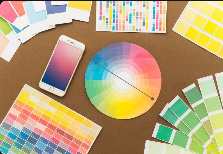
In the realm of Visual Branding & Design, color acts as a foundational layer that shapes perception even before words are read or messages understood. It is often the first impression, the emotional hook, and the signal of trust or dissonance. While many marketers rely on surface-level color guides, the truth is that effective color use involves understanding the emotional and physiological responses it triggers, the cultural meanings attached to it, and how it aligns with brand identity. Integrated properly into a comprehensive Visual Branding & Design system, color can amplify user experience, direct attention, and establish emotional continuity across platforms.
This guide merges scientific data, case studies from industry leaders like Coca-Cola and Tiffany & Co., and neuromarketing research to decode how color influences perception and behavior. It also explores how strategic color application enhances brand memorability, engagement, and trust.
The Science behind Color: Neurology, Emotion, and Behavior
How Color Stimulates the Brain
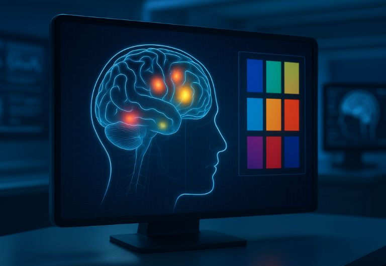
Color activates specific regions of the brain responsible for memory, decision-making, and emotion. For example, the ventromedial prefrontal cortex critical in evaluating rewards is stimulated more intensely by red and yellow tones, often seen in fast-food branding. These warm hues activate the sympathetic nervous system, subtly elevating heart rate and encouraging rapid decision-making, which makes them especially effective in fast-paced consumer environments.
Color and Emotional Response
Neuromarketing studies using fMRI scans have confirmed that consumers associate cool colors like blue with trust, stability, and professionalism due to their calming impact on the amygdala, the brain’s fear center. Blue hues reduce cognitive stress and promote feelings of serenity, which is why they are frequently employed by banks, insurance companies, and tech brands aiming to establish credibility and reliability. Green, on the other hand, stimulates the medial orbitofrontal cortex, a region linked with reward and emotional valuation making it highly effective for wellness, sustainability, and lifestyle branding.
The Legacy of Louis Cheskin
Louis Cheskin, a pioneer in color marketing and perceptual psychology, demonstrated through decades of experimentation that consumer responses to packaging, logos, and even taste perceptions could be predicted based on subtle shifts in hue. His groundbreaking work with major corporations like Ford and McDonald’s revealed that even minor changes in saturation or brightness could dramatically alter public perceptions of taste, quality, and product value. For example, a slightly more saturated red on a food package might be perceived as fresher or more flavorful.
Cheskin introduced the concept of “sensation transference,” the idea that consumers transfer their feelings about packaging design including color to the product itself. This theory revolutionized packaging strategies and is still foundational in modern brand psychology. His research proves that color not only communicates meaning but can physically alter the sensory experience, including how we perceive flavor, temperature, and even texture.
Neurological Footprint of Color
These insights validate the foundational principle: color does not just decorate a brand; it defines its neurological footprint in the consumer’s brain. It creates associations, builds emotional memory, and embeds itself into the user’s subconscious. From activating dopamine pathways to reinforcing brand schemas in long-term memory, color is an indispensable component of strategic marketing that engages not just the eye, but the entire brain.
Colors like red and orange trigger alertness and urgency due to their high wavelength, while blues and purples, with lower wavelengths, foster contemplation and relaxation. This physiological difference in light energy directly maps to cognitive and emotional processing pathways, giving marketers a unique toolkit to guide emotional flow and behavioral nudges.

Quick Judgements: Color’s Role in First Impressions
Why First Impressions Are Color-Driven
First impressions are often irreversible, and color shapes them instantaneously. A study from the University of Winnipeg confirms that up to 90% of snap judgments about products can be color-based. Our visual cortex processes color before any other visual data, which means consumers make emotional decisions about a product before reading a single word. This makes color one of the most powerful yet underutilized tools in marketing strategy.
The Psychology of Luxury vs. Affordability
Luxury brands frequently employ deep tones like black, navy, and burgundy to signal sophistication, exclusivity, and power. These hues evoke a sense of premium quality and restraint. On the other end, budget-friendly or youth-oriented brands lean toward bright, energetic hues like orange, yellow, and lime green, conveying fun, approachability, and spontaneity. This strategic separation helps consumers instantly categorize brand positioning and price expectations, even without product details.
Strategic Use in UI and E-Commerce
Color psychology is equally important in digital environments. Consider how Amazon subtly uses orange for “Add to Cart” buttons, a color known to trigger excitement and impulse. Similarly, blue hyperlinks have become universal indicators of trust and action. Heatmap studies show that users gravitate toward warmer tones for action and cooler tones for content absorption. Designing with intentional color placement can significantly increase engagement, click-through rates, and conversion.
Subconscious Signaling in Packaging
In product packaging, first impressions are made within milliseconds on the shelf. A matte black finish may denote luxury skincare, while a neon pink wrapper signals playfulness and indulgence. Research shows that packaging color influences not only purchase decisions but also post-purchase satisfaction. Consumers often rationalize their buying decisions based on the visual cues they absorbed subconsciously, making color a key element in long-term brand loyalty.
The Role of Color in Brand Recall
Color enhances memory encoding. Studies show that people are up to 80% more likely to remember a brand if it is associated with a signature color. Think of UPS brown, Cadbury purple, or Starbucks green; these colors act as cognitive shortcuts. Consistent use of a primary brand color across all touchpoints builds recognition, trust, and emotional familiarity, turning first impressions into long-lasting brand relationships.

Color Meaning: Context, Culture & Contrast
Cultural Interpretations of Color
Color’s meaning is not universal. Red can denote prosperity and celebration in Chinese culture but may signal danger or error in Western contexts. Similarly, white symbolizes purity in some societies and mourning in others. In India, saffron carries spiritual significance, while green in Islamic cultures symbolizes paradise and purity. As brands increasingly serve global audiences, understanding these divergent interpretations becomes essential to avoiding cultural faux pas that could alienate customers.
The Power of Naming and Perception
Even the names given to colors influence perception. Studies have shown that people rate products with colors labeled “mocha,” “vanilla cream,” or “sky blue” more positively than identical items labeled “brown,” “off-white,” or “light blue.” These verbal associations shape emotional responses before a product is even used. As a result, marketers must strategically name their color palettes to align with aspirational or sensory-driven branding goals.
The Role of Context and Combinations
Color does not exist in isolation. Its meaning is influenced by adjacent colors, context, and design hierarchy. For example, pairing red with gold can evoke luxury, while red with black may suggest danger or rebellion. A muted palette can convey elegance, while high-saturation combinations can signal fun or affordability. These contextual cues should be fine-tuned depending on whether the brand intends to project stability, excitement, luxury, or approachability.
Designing for Accessibility and Inclusion
Inclusive design practices demand that color be used responsibly. Marketers must consider those with visual impairments, such as color blindness, by ensuring adequate contrast ratios and avoiding reliance on color alone to convey meaning. For example, using both color and shape to indicate active/inactive states in a UI button benefits all users. Accessibility is not just ethical; it’s a strategic advantage that expands reach and usability across demographics.
Emotional Layers in Cultural Design
Beyond surface symbolism, colors evoke deep emotional responses rooted in early experiences and social conditioning. For instance, children in the U.S. often associate yellow with school buses and learning, creating a sense of energy and optimism. In contrast, the same color might symbolize jealousy or cowardice elsewhere. Brands must analyze not only cultural codes but also emotional triggers embedded in audience memory when selecting and deploying color schemes.
Image Prompt: [Two sets of the same website homepage in different languages and color palettes tailored for Western vs. Asian audiences; laptops on a desk with cultural artifacts like tea cups or books.]
Branding in Action: Lessons from Big Names
Tiffany & Co.: Luxury Encoded in Blue
Tiffany & Co.’s robin’s-egg blue is one of the most recognizable brand colors in the world, and for good reason it is trademarked and associated with luxury, heritage, and timeless elegance. This specific hue triggers emotional responses linked to exclusivity and romance, supported by the brand’s strong visual consistency across packaging, marketing, and retail design. Psychologically, soft blues are perceived as calming and aspirational, reinforcing Tiffany’s status as a high-end, emotionally resonant brand. The visual identity is so powerful that the color alone can evoke emotional memories of celebrations, proposals, and milestones, proving that color can be more than aesthetic, it can be legacy.
Coca-Cola: The Power of Emotional Tradition
Coca-Cola’s vibrant red does more than stand out; it stimulates energy and emotion. Red is associated with arousal and urgency, making it a perfect match for a brand rooted in joy, spontaneity, and universal recognition. Red also increases heart rate and appetite, which may explain its prevalence in the food and beverage industry. But Coca-Cola doesn’t just use red; it owns it. The consistency of the red label across every global market cements its position as a tradition-bearing, emotionally charged brand. This deep emotional anchor, built over decades, allows Coca-Cola’s red to function as a global language of happiness and refreshment.
Spotify: Freshness in the Audio Space
Spotify’s green isn’t just a nod to freshness, it represents the brand’s innovation and creative fluidity in a sound-driven industry. Green is psychologically linked to growth, vitality, and renewal. In contrast to competitors like Apple Music or Amazon, Spotify’s bold and youthful shade of green instantly conveys a modern, inclusive brand identity. It also visually pops against darker backgrounds, a smart move for mobile app visibility and usability. The color becomes a part of the listening experience, associating musical discovery with energetic, forward-thinking vibes. Spotify has transformed an ordinary color into an audio lifestyle signal.
PayPal: Trust Built with Blue
In A/B neuromarketing tests, PayPal found that blue-colored CTAs (call-to-action buttons) increased user trust and action rates by over 20%. Blue evokes trust, security, and logic perfect for a platform dealing with money and digital transactions. Their UI balances several shades of blue with clean, minimal white space, optimizing both aesthetics and user psychology. The success of this approach confirms that choosing the right color isn’t about trendiness; it’s about alignment with user intention and emotional needs. PayPal demonstrates how color can directly impact business metrics through psychological resonance.
The Bigger Picture: Strategic Color Ownership
These case studies illustrate that color isn’t just aesthetic; it’s strategic. From Tiffany’s protected blue to Coca-Cola’s energizing red and Spotify’s vibrant green, each brand demonstrates how color selection creates emotional contracts with consumers. Well-aligned color schemes deepen brand recall, reinforce personality, and set companies apart in saturated markets. More importantly, consistency builds trust, an intangible but critical factor in customer retention. When used deliberately and consistently, color becomes one of the most effective branding tools available.
Practical Playbook: Choosing Your Brand Colors
Match Color to Brand Personality & Audience
Color should align with the brand’s core identity and emotional proposition. Red suits brands seeking passion and action, while blue is ideal for those wanting to convey reliability. Green fits wellness and eco-focused missions, and purple implies innovation or luxury. Demographic preferences also matter: research suggests women favor blue and purple, while men gravitate toward blue and green. A misaligned color can alienate or confuse potential customers, especially if it clashes with your value proposition.
Test & Validate with Data
Rather than guessing, smart brands test color in context. A/B testing different button colors, packaging designs, or ad creatives can yield measurable differences in conversions. Tools like heatmaps, eye-tracking studies, and EEG assessments offer objective insights. For example, one e-commerce company found that switching from blue to red buttons increased click-throughs by 21% in impulse-driven campaigns.
Design for Accessibility & Culture
Color-blind users often miss critical visual cues. Use contrast checkers to ensure visibility and avoid color-reliant messaging. Also, adapt palettes for regional resonance. A luxury brand in Japan may avoid pure white for packaging, while a youth brand in Brazil may lean into vibrant tropical tones. Empathy and cultural fluency should guide every chromatic decision.
Conclusion
Color is a silent ambassador for your brand. It whispers messages to your consumer’s subconscious, accelerates emotional connection, and drives action without a single word. By understanding the science, respecting cultural nuance, and strategically aligning with brand identity, marketers can transform color from decoration into differentiation.
But beyond color lies the broader discipline of Visual Branding & Design, where every visual element, typography, spacing, layout, and especially color works together to craft an experience. When color choices complement the overall design system, they not only enhance aesthetics but also drive engagement, increase trust, and shape long-term brand memory. From the psychology of hues to the tactile associations of materials, visual branding touches every point of user interaction. The most memorable brands are those that use color with intention, aligning visual design with emotional strategy.
Whether you’re launching a startup or rebranding a legacy product, let color psychology be your compass in creating emotionally intelligent design systems. Prioritize coherence, inclusivity, and storytelling in your Visual Branding & Design, and you’ll build more than just brand recognition you’ll foster deep, enduring relationships with your audience.
FAQ
1. How do I choose the right brand color that resonates with customers?
Choosing the right brand color starts with a deep understanding of your brand’s personality and core message. Are you bold and energetic, or calm and trustworthy? Color psychology provides a useful starting point, but must be balanced with audience expectations and industry norms. For instance, wellness brands may lean toward greens, while tech startups often choose blues. Don’t forget to use digital tools like Adobe Color to test harmonies and audience reactions before finalizing a palette.
2. Is red always better for sales and urgency?
Red is powerful, but context is everything. It excels in stimulating urgency and action in fast-moving retail environments, such as sales or food services. However, in luxury branding or wellness sectors, it may appear aggressive or overwhelming. Blue or green can often outperform red when trust, calmness, or sustainability are priorities. Always match the color to the emotional tone you want to set.
3. Can cultural differences hurt my color choice?
Absolutely. A red logo might convey good luck in China but symbolize danger in Western markets. These nuances matter in global branding. Thorough research into local cultural associations, religious beliefs, and historical uses of color is essential. Color symbolism can make or break first impressions. Global brands often tweak color schemes slightly for regional campaigns to maintain emotional accuracy.
4. Do I need neuromarketing data to pick a palette?
Not necessarily, but it can sharpen your strategy. Neuromarketing tools like EEG or eye-tracking studies offer deep insights into subconscious reactions, helping you understand what truly engages your audience. For smaller teams, even surveys and A/B testing can offer directional insight. What matters is evidence-based decision-making that balances art with behavioral science.
5. What if my color looks “cheap” how do I adjust perception?
If your brand color feels budget or unrefined, focus on how you use it. Pairing bright colors with high-contrast neutrals can elevate the perception instantly. Adjusting tone, saturation, and texture within your packaging or digital assets also helps. The same red can scream discount or sophistication depending on typography, layout, and supporting visuals. Context, as always, is king.