Brand Texture Guidelines: Crafting a Cohesive Visual Identity
Introduction
In the intricate world of visual branding and design, texture remains one of the most overlooked yet powerful tools. While most brands invest heavily in defining color palettes, logos, and typography, few give structured thought to how texture plays into the brand’s emotional resonance and consistency. Texture in branding refers to the visual or tactile feel communicated through design elements—whether it’s the soft linen backdrop on a business card or the gritty grain on a product label. Scientific studies in neuromarketing suggest that texture triggers sensory memory more effectively than color alone, making it vital for long-term brand recall.
Moreover, texture isn’t just about aesthetics—it’s about crafting a tangible, memorable brand experience across digital and physical touchpoints. From websites to packaging, textures contribute to a cohesive brand identity. This article explores how brands can formulate specific guidelines for using texture, thus elevating their overall brand strategy and preventing common inconsistencies.
What Are Brand Textures and Why Do They Matter?
Understanding Texture in Branding
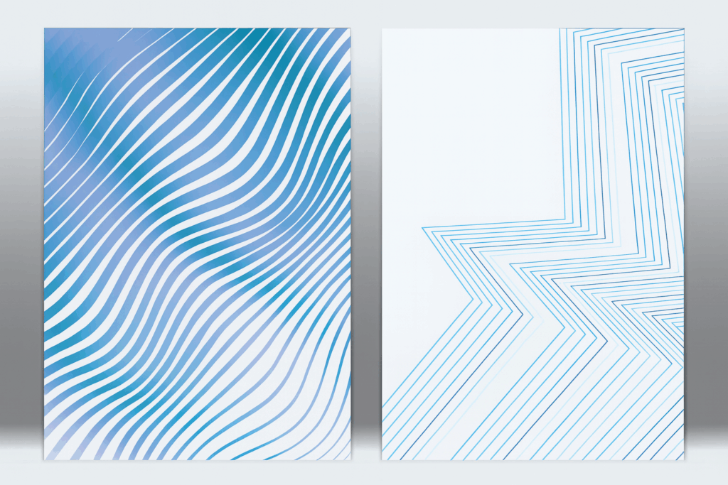
Brand textures are graphical or physical elements that evoke a specific feel or mood through design. These can include digital overlays that resemble paper grain, leather, fabric, metal, concrete, or even abstract patterns like noise, glitch, and organic shapes. Textures add depth and emotion to branding, helping differentiate brands in a saturated market.
Real-World Examples
For instance, a brand that sells artisanal coffee might use burlap or grainy paper textures to reinforce its handmade, rustic positioning. Conversely, a tech startup might use slick, glossy surfaces or grid textures to convey innovation and precision. The texture acts as a silent partner to the brand’s tone, supporting the message without overpowering it.
The Emotional Power of Texture
Textures aren’t mere decorations; they play a vital role in forming emotional connections. When consumers feel a sense of tactile familiarity—like the roughness of craft paper or the softness of suede—it adds to brand recall and emotional loyalty.
Yet, many brands skip defining texture guidelines, resulting in jarring user experiences where a business card feels earthy, but the website looks sterile. According to Aqomi, properly integrated textures make brands more memorable and emotionally resonant. Texture, when done right, becomes the bridge between visual style and emotional memory.
The Psychology Behind Texture in Branding
Texture and the Brain
Texture has a deep psychological impact on how users perceive and interact with a brand. Research in cognitive psychology indicates that visual texture activates the somatosensory cortex—making the brain simulate touch, even when there is no physical contact. This phenomenon allows a visually rough texture to feel rugged or earthy, while smooth, glossy visuals can feel luxurious or sterile. The human brain is wired to seek sensory cues for understanding the environment, and visual texture serves as a shortcut for interpreting brand personality, quality, and intent.
When brands utilize texture thoughtfully, they tap into this subconscious processing to leave a stronger imprint. Studies have shown that consumers are more likely to recall advertisements or product designs that incorporate tactile cues—even when only experienced visually. This cross-sensory stimulation builds emotional resonance and increases retention.
Texture and Brand Perception
Textures help communicate brand values without relying on words. A recycled paper texture immediately suggests eco-friendliness, while high-contrast metallic textures can imply luxury and high performance. Velvet or suede-like textures may communicate softness and care, ideal for skincare or baby product brands, while gritty textures imply ruggedness and authenticity—perfect for outdoor or adventure brands.
Moreover, texture provides cultural and contextual cues. For example, a terracotta texture can evoke Mediterranean aesthetics, while bamboo or woven straw might signal Asian heritage or sustainability. Texture, when aligned with audience expectations and cultural nuances, becomes a silent language of brand storytelling.
Minimalism vs. Richness
A common fear among brand managers is that texture might clutter minimalist aesthetics. But clarity and texture are not mutually exclusive. Subtle applications—like low-opacity overlays, soft shadows, or micro-textures—can enhance visual interest while maintaining clean layouts. In fact, many minimal brands use texture sparingly to add dimension and avoid flat, lifeless design.
For example, a minimalist fashion brand may use a concrete background texture at 10% opacity on its product catalog to convey urban sophistication. Similarly, a digital app might apply a micro-grain texture behind icons to create contrast and improve visual hierarchy without compromising modern UI cleanliness.
Texture can also be a branding asset in accessibility. For users with visual impairments, slight textural differences can enhance navigability and clarity. Combined with color contrast and hierarchy, this allows for a more inclusive design experience.
Ultimately, it’s not about adding texture everywhere—it’s about intentional placement, balance, and alignment with the brand’s ethos. Minimalism and richness aren’t opposing forces but can harmonize through strategic textural expression.
Common Mistakes Brands Make with Texture
Even though texture can be a powerful branding tool, when misapplied, it can create more confusion than clarity. Recognizing and avoiding common pitfalls is crucial to maintaining a cohesive and professional brand presence across all touchpoints. Here are several key mistakes that many brands make with texture—and how to avoid them.
Inconsistency Across Mediums
Despite its potential, improper use of texture can undermine a brand’s integrity. One of the most common and damaging errors is inconsistency—where textures vary across marketing materials, leading to a disjointed brand experience. For example, a brand might use a tactile canvas texture on its physical packaging but opt for a sleek, textureless layout on its digital platforms. This inconsistency breaks the emotional continuity that texture is supposed to reinforce.
The result? Confused consumers who struggle to associate one brand experience with another. Such gaps dilute trust and reduce overall brand recall. Brands should audit all customer touchpoints—web, mobile, print, merchandise, social media—to ensure texture application is both present and coherent. Texture guidelines should be standardized across teams, with clear instructions on scale, resolution, and use-case scenarios.
Misaligned Style Choices
Another major pitfall is choosing textures that clash with your brand personality. For instance, a soft, feminine skincare brand using harsh metal or concrete textures sends mixed visual signals to its audience. Similarly, a tech company aiming for a clean, future-forward image may inadvertently use outdated grunge textures that evoke the 2000s internet era.
Texture should reflect the tone, values, and audience expectations of your brand. A mismatch creates cognitive dissonance—your visuals are saying one thing while your messaging says another. Conduct regular brand alignment reviews where design elements, including textures, are evaluated for stylistic consistency with your brand’s evolving positioning.
Additionally, consider cultural relevance. Textures that are perceived one way in one market may hold different connotations elsewhere. Always account for audience diversity when selecting or applying textures globally.
Overusing Trendy Effects
Trends can be tempting, especially in fast-paced digital environments where design aesthetics evolve rapidly. However, applying trendy textures (like glitch, grain, holographic gradients, or excessive overlays) without assessing their long-term relevance can lead to visual fatigue. What’s stylish today may appear outdated or gimmicky six months later.
This issue is particularly problematic in industries where trust, clarity, and professionalism are paramount—such as finance, healthcare, or legal services. Over-textured visuals in these fields can appear unserious or distracting, potentially harming brand credibility.
Instead of chasing trends, aim for timelessness. Use trend-based textures sparingly, and always test them with real users or internal reviewers. If a trendy texture is introduced, monitor its performance closely and prepare a phase-out plan should it become obsolete.
User Insight:
“I used grunge textures in my branding and now it feels dated after 6 months.” – Reddit user
To future-proof your texture strategy, always align texture choices with brand pillars, audience expectations, and visual durability. Think of texture as a foundational element—not a seasonal accessory.
How to Create Your Own Brand Texture Guidelines
Creating effective texture guidelines for your brand is not just a matter of visual preference—it’s a strategic exercise in defining how your audience will experience your brand on a sensory level. A robust system helps maintain consistency, supports emotional storytelling, and eliminates guesswork for designers and content creators alike. Below are the key steps to developing texture guidelines that align with your brand’s core identity.
Step 1: Define the Role of Texture in Your Brand System
Begin by clarifying what role texture will play in your brand ecosystem. Will it function as a background enhancer, a focal element, or a subtle accent? Different roles will influence how dominant or subdued the texture appears in layouts.
Start by revisiting your brand’s core values and visual tone. A wellness brand that prioritizes calmness and nature might benefit from organic, fibrous textures like woodgrain, linen, or handmade paper. On the other hand, a cybersecurity firm emphasizing precision and digital innovation may choose abstract, glitch-inspired textures or carbon fiber weaves.
Ask guiding questions: Does the texture reinforce your emotional tone? Can it be applied consistently across digital and print? Will it complement or compete with your brand colors and typography? Your answers will help establish the strategic use of texture and its relevance to the rest of your brand system.
Texture should also map to the consumer journey. For instance, tactile textures may be emphasized more in packaging or printed collateral, while digital texture use may require lightness and subtlety to prevent UI interference.
Step 2: Build a Texture Library
Once the role is defined, begin curating a library of textures that are on-brand and versatile. These can be:
- Custom illustrations or scans of physical materials
- Photographic textures from real-world objects (e.g., stone, leather, fabric)
- Digital abstractions created with design software
- Stock textures from platforms like Adobe Stock, Shutterstock, or Unsplash
Be sure each texture is available in high resolution and flexible formats such as PNG, TIFF, or vector-based SVGs. Organize your texture library by categories such as tone (light/dark), material (natural/synthetic), use-case (web/print/social), or emotional quality (warm/cool, rugged/clean).
Provide documentation or naming conventions that help team members identify the right texture for the right task. Avoid overstuffing the library—aim for clarity and intentionality over sheer volume.
Tip: Create both raw and modified versions (e.g., monochrome, masked, low-opacity) of each texture to increase versatility while reducing file redundancy.
Step 3: Test Across Contexts
Textures behave differently across touchpoints, and this variance must be tested rigorously. A texture that looks vibrant on a desktop may appear muddy or pixelated on mobile. A tactile texture used in packaging may not translate well on digital banners. To maintain control over user experience, conduct extensive testing across platforms:
- Screen sizes: desktop, tablet, mobile
- Output types: print, web, app, email, merchandise
- Color modes: RGB for digital, CMYK for print
- Use-cases: background textures, UI overlays, photography masks
A/B testing can be incredibly useful here. Show variations of the same layout with and without texture to focus groups or internal teams. Measure responses around brand perception, clarity, and emotional impact. Also test performance: does a texture slow down site loading times or clash with accessibility standards?
Capture insights in a feedback report and adjust texture usage accordingly. Testing ensures your textures support the brand’s message without compromising usability or professionalism.
Step 4: Set Do’s and Don’ts
A well-documented set of rules prevents misuse and preserves brand integrity. Include the following considerations:
- Opacity Guidelines: Recommend specific percentages for digital and print contexts (e.g., 10% for background, 30% for overlays)
- Layering Rules: Should texture sit beneath text? Overlays? Are blend modes allowed?
- Color Usage: Can the texture be recolored to match themes, or should it remain in its original palette?
- Cropping & Scaling: Provide instructions on resizing to maintain fidelity without distortion
- Application Restrictions: Clarify where textures should never be used (e.g., logos, body text, accessibility-critical areas)
Use plenty of visual examples: side-by-side “right vs. wrong” applications, screenshots from live use cases, and annotated layouts. This visual education saves time during onboarding and design reviews.
Reinforce that the purpose of these rules is not to restrict creativity but to channel it through a consistent and purposeful framework.
Step 5: Integrate into Brand Style Guide
To ensure your brand texture guidelines are actionable, incorporate them directly into your comprehensive style guide or brand book. This document should not only include the texture library but also usage principles, do’s and don’ts, and context-based best practices.
Your style guide should contain:
- Approved texture swatches in various formats
- Grid-based mockups showing placement rules
- File access links to shared folders or digital asset management systems
- Usage FAQs or troubleshooting tips (e.g., what to do if a texture distorts on a new medium)
For teams using platforms like Figma or Sketch, create texture-enabled design systems or components that allow designers to drag-and-drop approved textures into their workflows. For non-designers (e.g., social media managers), build editable templates with locked texture layers in Canva or Adobe Express.
This holistic integration ensures that texture usage is not siloed to the design team but is embedded across all brand communications. Done right, your texture system becomes as foundational as your logo, typeface, or brand voice—an invisible signature tying every piece of content back to a unified identity.
Best Practices from Successful Brands
Apple
Apple avoids overt textures but uses depth through shadows and glassy interfaces to suggest elegance and innovation.
Patagonia
Patagonia uses fabric textures in digital assets to align with their rugged, outdoorsy brand persona, creating harmony with their product range.
Glossier
Glossier subtly incorporates pastel textures and glossy overlays to evoke skincare and softness, creating a seamless experience across social, packaging, and retail environments.
“Great brands use texture not to decorate, but to differentiate.” – Brand Aesthetics Journal
Conclusion
In the ever-evolving branding landscape, texture is no longer optional—it’s a necessity for brands aiming for depth, differentiation, and emotional engagement. While logos and color palettes form the foundation of a brand’s visual identity, texture adds the layers of nuance that make a brand truly memorable. It’s what elevates flat visuals into rich experiences and transforms generic assets into emotionally resonant touchpoints.
Crafting clear brand texture guidelines ensures consistency across platforms—from websites and apps to packaging and promotional materials. It eliminates ambiguity for designers, empowers marketers, and maintains visual harmony across all brand expressions. More importantly, it speaks directly to your audience’s subconscious, influencing how they feel about your brand before they even realize it.
When applied thoughtfully, texture can reflect your brand’s story, values, and promise. Whether it’s the rawness of recycled paper signaling sustainability, or the sleek gloss of a digital overlay representing innovation, textures help anchor abstract brand ideas into tangible, sensory-driven realities.
Brands that master the integration of texture position themselves not just as visual entities, but as experiential ones. They communicate with clarity and confidence, leveraging every design layer—seen or felt—to deepen engagement and build lasting trust.
By treating texture not as an afterthought but as a strategic design element, your brand can move from ordinary to unforgettable, from functional to phenomenal.
FAQ
1. What if I don’t want texture in my minimalist brand?
A: You can absolutely maintain a minimalist aesthetic while still integrating texture. The key lies in subtlety—think soft shadows, slight embossing, or micro-textures that add dimension without clutter. Texture doesn’t have to be gritty or loud; it can simply provide tactile interest and a sense of materiality. Minimalism is about intentionality, not flatness. With thoughtful application, texture can enhance rather than compromise minimalism.
2. Can I use real-world materials as textures in branding?
A: Yes, real-world materials are excellent sources for brand texture, especially when they align with your product values. A leather texture may suggest craftsmanship and luxury, while recycled paper evokes sustainability and earth-consciousness. These materials help ground your brand’s values in visual storytelling. When scanned or photographed correctly, they bring authenticity to digital environments. Just ensure high-resolution capture and clean edits.
3. How do I ensure texture consistency across web and print?
A: To maintain texture consistency across mediums, use high-resolution files like TIFFs or scalable vector textures. Always test your textures under both RGB and CMYK formats to ensure accurate reproduction in both digital and print. Keep textures subtle enough to not interfere with text or layout hierarchy. Set clear usage guidelines in your brand book, including scaling rules and approved opacity levels. Conduct test prints to catch potential discrepancies early.
4. Should I avoid texture for digital-first brands?
A: Not at all—texture can enhance digital experiences when used mindfully. Subtle UI textures, like grain overlays or soft gradients, can improve usability and guide user attention. They also help break visual monotony, especially in minimalist web designs. However, performance and accessibility should guide application. Lightweight textures that don’t interfere with responsiveness or screen clarity are ideal for digital-first brands.