Activating Visual Branding: Techniques for Eye-Catching Consistency

Introduction
In the digital economy, first impressions are made in milliseconds—and they’re almost always visual. Visual Branding & Design has become a non-negotiable for businesses aiming to stand out in saturated markets, yet many still treat it as an afterthought or surface-level polish. According to a study by the Missouri University of Science and Technology, it takes users just 2.6 seconds to form an opinion about a website’s visual appeal. In those few seconds, color, typography, and imagery work together to evoke trust, emotion, or confusion.
But Visual Branding & Design is far more than aesthetics. It’s a strategic tool that bridges brand identity with human psychology—activating emotion, building recall, and guiding user behavior across every touchpoint. In this guide, we’ll explore how to move beyond decoration and harness the full power of visual strategy to create branding that doesn’t just look good—but actually works.
Understanding Brand Visual Activation & Its Strategic Roots
In the modern branding landscape, where attention spans are fleeting and competition is intense, brand visual activation emerges as a cornerstone strategy for building memorable and emotionally resonant brands. It’s not just about looking polished—it’s about activating the senses, stirring emotions, and fostering deep connections that linger beyond the first impression. Unlike traditional design exercises, visual activation is the deliberate orchestration of visual elements—color, typography, imagery, and layout—to bring a brand’s personality to life in a way that influences perception and inspires action.
At its core, brand visual activation differs from basic brand identity work by focusing on implementation rather than just definition. While brand identity defines the DNA of your brand (mission, values, tone), visual activation expresses it in the real world through interactive, emotional, and context-rich experiences. This distinction is often blurred, leading to a common pain point: businesses investing heavily in design but failing to connect it to strategic outcomes. As one frustrated Reddit user put it, “I thought our new logo would do the trick. Turns out, our visuals looked great but didn’t move the needle. We lacked a visual strategy, not assets.”
A helpful analogy is to think of brand identity as the blueprint, and visual activation as the construction and interior design. It’s the difference between having a beautiful logo sitting in a PDF and seeing that logo come to life on a subway billboard, app interface, or packaging design that customers can’t help but Instagram.
According to a comprehensive guide by YouScan, effective brand activation strategies must do more than look good. They must “make people do something, feel something, and actually remember your brand message.” This aligns with a foundational principle in branding psychology: memory is encoded by emotion, not logic. In fact, a recent Statista Q3 2024 study revealed that 61% of consumers prioritize trust—which is deeply influenced by emotional resonance—when interacting with brands.
The process of visual brand activation typically begins with a deep understanding of your audience—through tools like social listening, analytics, and interviews. This insight fuels decisions around which emotions and actions you want to provoke. For example, Red Bull’s globally recognized Stratos campaign didn’t rely on a static logo or a tagline. It visually activated the brand’s spirit—daring, energetic, and extreme—through visuals, video, and action, producing unforgettable emotional impact (YouTube: Red Bull Stratos).
Another critical distinction lies in the metrics. Traditional branding measures recognition; activation measures engagement, user-generated content (UGC), share of voice, and brand recall post-interaction. These are not vanity metrics—they’re essential markers of visual strategy success.
Key Elements of Eye-Catching Visual Branding
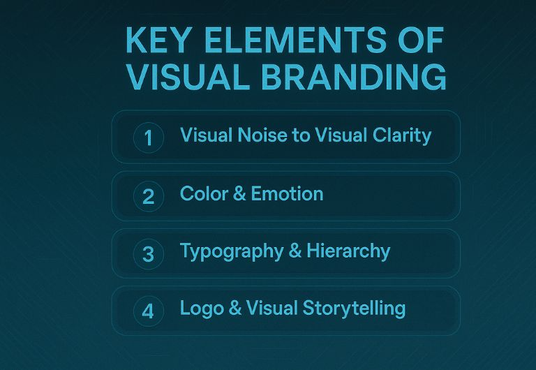
From Visual Noise to Visual Clarity
When brands attempt to “look good,” they often end up drowning in visual noise—a mismatch of fonts, colors, and images that confuse rather than captivate. The antidote to this chaos is mastering the key elements of visual branding, which allow a brand to speak clearly, consistently, and emotionally across every touchpoint. Whether on a business card or a TikTok video, visual branding must reflect and reinforce the brand’s core identity.
These elements—color palette, typography, imagery, layout, and logo—are not just aesthetic choices. They’re strategic tools that anchor a brand’s presence in the market. When used correctly, they ensure that your brand visual activation is not just consistent but magnetic.
Color & Emotion: Choosing a Palette That Resonates
Colors aren’t just decoration—they’re emotion in visual form. According to color psychology, blue often evokes trust, red signals urgency or passion, while green aligns with growth and health. A well-chosen color palette can subconsciously steer perception and behavior.
“A potent visual language is essential in crafting a compelling brand identity that resonates with the intended audience.” — (Medium.com/@designgrapes, 2023)
The key is emotional alignment. If your brand stands for calm confidence, but your palette is bright and jarring, you’re setting off a subconscious dissonance in your audience. This is where visual strategy overrules pure aesthetics.
Example: Spotify has maintained its signature green paired with black and white to symbolize both creativity and clarity—a choice that aligns with its intuitive, music-focused user experience.
Typography & Hierarchy: Guiding the Eye, Guiding the Mind
Typography is how a brand speaks visually. From bold, confident sans-serifs (like Nike) to elegant, humanist serifs (like Vogue), your typographic choices cue how you want people to feel and interpret your message.
But beyond font choice, it’s hierarchy—how you structure headlines, subheads, and body—that directs attention and comprehension. When hierarchy is done well, the user’s eye glides effortlessly from key messages to supporting details. Done poorly, and they’re overwhelmed—or worse, disengaged.
“Strong, consistent visual language establishes trust, transmits brand principles, and builds emotional connections.” (DesignGrapes, 2023)
Imagery & Visual Storytelling
Images tell stories faster than words. Strategic imagery—photos, illustrations, icons—should carry your brand’s message as clearly as your tagline. It’s not about stock photos that “look nice.” It’s about images that feel right and spark action.
Brands like Asana and Apple excel in this. Asana’s imagery communicates collaboration and clarity, while Apple’s sleek product visuals exude innovation and precision.
Your imagery must be on brand in lighting, tone, subject, and context. This is what builds visual consistency, which studies have shown increases brand recognition by up to 80%.
Logo & Visual Consistency: The North Star
Your logo is not your brand—but it is a key carrier of your identity. A well-designed logo should scale from a phone app icon to a billboard and remain recognizable. But more importantly, it should sit inside a system—supported by typography, color, and placement rules.
This is where visual consistency comes in. According to SiteImprove, brands with consistent visuals across channels see up to 3.5x stronger brand visibility and loyalty. It’s not just repetition—it’s reinforcement.
“Visual consistency builds trust and recognition. Inconsistency creates doubt and disconnect.” — (SiteImprove Blog, 2023)
Common Pitfalls and How to Avoid Overspending on Visuals
When Design Becomes a Money Pit
Many startups and even established brands fall into a trap: they pour money into stunning designs that look amazing in isolation but fail to generate brand loyalty, conversions, or engagement. This disconnect happens when branding is approached as an art project, not a visual strategy. The most frequent issue? Investing in the appearance of branding, not the activation.
“We spent $15k on a brand refresh and ended up with a prettier website… but our sales didn’t move an inch,” shared one frustrated founder on r/Entrepreneur.
This pain point—overspending on visuals without ROI—stems from skipping strategic steps like audience insight, goal-setting, and measurement. Aesthetic appeal alone doesn’t equate to business impact.
Strategy Before Design: The Anti-Waste Formula
Every dollar spent on design should map back to strategic intent. That means your brand visual activation efforts should begin with:
- Audience research: What emotions do they respond to?
- Value alignment: What does your brand stand for?
- Channel focus: Where will your visuals live and function?
- Emotional triggers: What do you want people to feel?
Only after answering these questions should you touch color palettes or typefaces. As YouScan puts it in their definitive guide on brand activation:
“Start by deeply understanding your audience using insight tools and social listening. Define the emotion and specific action you want your campaign to trigger.”
Brands that reverse this process—hiring a designer before hiring a strategist—end up with visuals that feel disconnected or trend-driven rather than intentional.
The Budget Myth: You Don’t Need a $50K Agency
There’s a persistent myth that professional visual branding requires tens of thousands of dollars. The truth is, smart brand teams prioritize guidelines and systems over endless custom design.
A clear brand style guide—even a lean one—can save thousands in future asset creation by creating repeatable rules. This includes:
- Logo usage
- Typography guidelines
- Color ratios
- Do’s and Don’ts for visual consistency
Example: McDonald’s brand guidelines PDF is a masterclass in scalable branding. So is Apple’s consistency across packaging, UI, and advertising.
“At the core of it, brand activation is the magic formula: awareness + engagement + action.”
Visual Consistency across touchpoints is what makes a $2,000 brand look like a $200K one.
Measure What Matters
Finally, you can’t optimize what you don’t measure. Design isn’t immune from KPIs. Your visual branding efforts should be tied to:
- Engagement rates on social and email
- User-generated content (UGC) inspired by brand visuals
- Sentiment analysis through social listening tools
- Brand mentions and share of voice
- Post-activation recall (can users describe your brand’s visual tone a week later?)
Case in point: Lean Cuisine’s #WeighThis campaign cost less than many rebrands and generated massive engagement by emotionally activating their brand message through visuals.
Bringing Brand Visual Activation to Life: A Step-by-Step Guide
From Strategy to Touchpoints: Making It Real
Too often, visual branding remains stuck in theoretical slides—“personas,” “moodboards,” “value pillars”—without ever making a tangible impact. Effective brand visual activation turns strategy into real-world touchpoints that drive awareness, emotion, and action.
This process doesn’t require a rebrand—it requires deliberate, phased steps that any brand can follow, whether you’re a lean startup or a global organization.
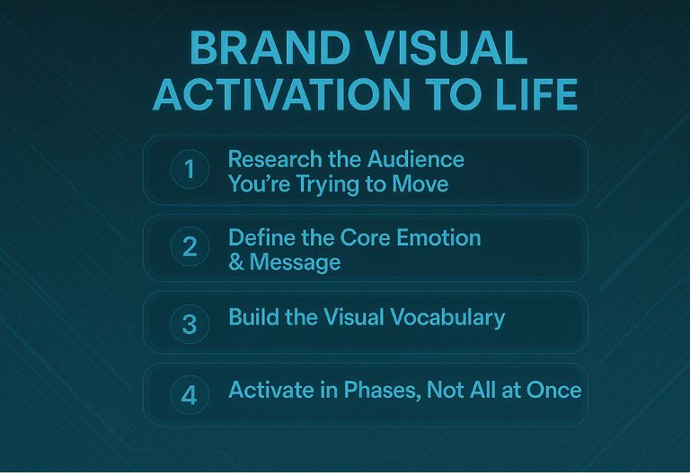
Step 1: Research the Audience You’re Trying to Move
All effective branding begins with empathy. You’re not just trying to impress — you’re trying to move someone. Use qualitative interviews, analytics, and social listening to understand:
- What your audience values
- How they describe your category
- What visuals they already trust or ignore
“Visual strategies must start with human behavior, not artistic preferences,” says branding strategist Sarah Doan. “The audience will always design the brand more than the designer does.”
Step 2: Define the Core Emotion & Message
Visuals are emotion in action. So, ask: What’s the one feeling you want people to associate with your brand?
Is it confidence? Safety? Excitement? Each emotion points to different aesthetic cues:
- Excitement → bright colors, bold typography, high-contrast visuals
- Safety → muted tones, soft shapes, consistent spacing
- Luxury → minimalism, serif fonts, negative space
Your visual strategy must align with this emotional trigger—then carry it across all brand assets.
Step 3: Build the Visual Vocabulary
This is the tactical part. You’ll define your:
- Primary logo and sub-variants
- Color palette (primary, secondary, accent)
- Typography (headlines, body, calls to action)
- Photography style (studio, lifestyle, flat lay)
- Iconography and graphic treatments
Don’t aim for “cool.” Aim for coherent. Every element must reinforce the brand’s desired feeling.
“Visual branding is successful when it becomes recognizable in the wild, even without a logo,” notes a contributor on r/branding. “It’s the feeling you recognize before you read the name.”
Step 4: Activate in Phases, Not All at Once
Rollout should be strategic, not chaotic. Start with high-visibility assets—social profiles, homepage, product packaging—before moving to lower-impact touchpoints.
- Phase 1: Website, social media, email templates
- Phase 2: Ads, packaging, merchandise
- Phase 3: Events, motion graphics, internal documents
Every launch should be backed by messaging and storytelling to help users interpret the new visuals.
Expert Insight
“Brands often forget the power of narrative in rollout. You need to introduce visual change like you’re launching a new product—build anticipation, communicate benefits, invite engagement.” — Agency partner at Moving Brands
Step 5: Test, Learn, and Evolve
Finally, visual branding isn’t static—it should evolve based on user engagement and performance. Use tools like:
- A/B testing on landing pages and social graphics
- Analytics on click-through and scroll behavior
- Surveys on emotional recognition and clarity
- AI image sentiment tools
Unique Angle in Practice: Emotional Triggers via Visual Consistency
Why Brands That Make You Feel Are the Ones You Remember
Think back to the last brand that made you feel something. It probably wasn’t because of a flashy logo or a clever tagline—it was the emotion conveyed consistently through every visual touchpoint: the packaging, the website, the tone of the imagery. This is where brand visual activation meets its highest purpose—not to decorate, but to activate emotion.
Emotional consistency is the superpower behind visual branding that sticks. It’s not about using the same colors everywhere—it’s about delivering a predictable feeling every time someone encounters your brand. According to Harvard Business Review, emotionally connected customers are 52% more valuable on average than satisfied ones. That kind of ROI doesn’t come from design trends—it comes from emotional triggers embedded into the visual system.
“You need emotional consistency, not visual variety,” said a top-rated Reddit contributor in r/branding. “Branding isn’t about keeping people impressed; it’s about keeping them sure of who you are.”
The Science Behind Emotional Visuals
Neuroscience tells us that emotion guides memory. When your brand visuals consistently reinforce the same emotional cue—whether it’s calm, rebellious, nurturing, or bold—your audience begins to trust your brand’s presence, even subconsciously.
Take brands like:
- Coca-Cola: Always cheerful, communal, celebratory. Their red and white visuals consistently evoke joy and nostalgia.
- Airbnb: Warm, inclusive, human-centered imagery in all their assets—from app design to Instagram stories.
- Nike: High contrast, bold, black-and-white photos with kinetic motion and minimalist type. Emotion = inspiration and power.
These aren’t just design styles—they’re emotional codes. You can feel these brands even without seeing their logos.
The Role of Visual Consistency
Brands that fail to maintain visual consistency across mediums risk eroding trust. A slick Instagram feed but clunky app interface sends mixed signals. Likewise, a premium-feel website but cheap-looking packaging breaks the emotional contract.
Consistency means applying your visual identity system with discipline—not just in look, but in tone. This includes:
- Lighting style in photos
- Motion behavior in videos
- Grid systems in layouts
- Spacing and hierarchy in typography
- Icon styles and illustration rules
“We began seeing a 30% lift in branded search and recall just six months after rolling out consistent visuals across all assets,” shared the CMO of a DTC brand in MarketingProfs.com.
That’s because consistency builds familiarity. Familiarity breeds trust. And trust turns into preference.
Emotions Are Scalable—Designs Are Not
A crucial distinction: design styles will trend and fade, but emotions scale over time. Your brand’s emotional DNA should remain stable even as your design evolves.
That’s why every decision in your visual activation process should ladder up to a core emotional idea. You can change from flat design to skeuomorphic styling—but the feeling should stay the same.
Example: The New York Times refreshed its visuals multiple times, but the tone—serious, authoritative, elegant—has remained intact for over 100 years.
Conclusion
Visual Branding & Design isn’t about decoration—it’s about deliberate emotional activation and strategic communication. From color theory and typographic hierarchy to campaign rollout plans and measurable KPIs, every visual element should serve a purpose rooted in brand identity. Effective Visual Branding & Design transforms abstract values into tangible experiences that audiences can see, feel, and remember. By mastering visual consistency and embedding emotion into every touchpoint, brands not only differentiate themselves in cluttered markets—they build lasting relationships. In a saturated world driven by visual noise, it’s not the loudest design that wins, but the most emotionally coherent. Because at the end of the day, connection is the most valuable currency a brand can earn.
FAQ
1. What is the difference between visual branding and brand identity?
Visual branding refers to the design elements you use—like color, typography, and imagery—to represent your brand. Brand identity is broader and includes your values, voice, personality, and positioning. In simple terms: identity is the strategy, visual branding is its expression. You can change your visuals over time, but identity should remain consistent. Both must align to avoid confusing your audience.
2. How do I create a cost-effective brand visual activation campaign?
Start with strategy: define the emotion you want to evoke and research your audience’s preferences. Build a lean, scalable style guide instead of dozens of unique assets. Focus on high-impact platforms first—social media, website, email. Use tools like Canva, Figma, or free templates to prototype fast. Always test visual engagement before scaling design spend.
3. Why do many branding projects fail despite good design?
Because design alone doesn’t move people—emotional consistency does. Many brands focus on trends instead of audience resonance. Without strategy, visuals become decoration, not activation. Always tie visuals to brand goals, emotion, and behavior. As one Reddit user said, “Looks nice ≠ sells well.”
4. How can I measure the effectiveness of my visual branding?
Track engagement metrics—click-through rates, scroll depth, bounce rates—on branded visuals across platforms. Use sentiment analysis tools to evaluate emotional reactions. Monitor share of voice, user-generated content, and brand recall in surveys. Look for consistency in how your audience describes your brand. Design success shows up in behavior, not likes alone.
5. Is it okay to update my visual branding over time?
Yes, and in fact—it’s necessary. As your audience evolves, your visual system should flex without losing its emotional core. Keep your visual strategy rooted in one consistent feeling, even if fonts or layouts change. This maintains brand trust while staying relevant. Think evolution, not overhaul.