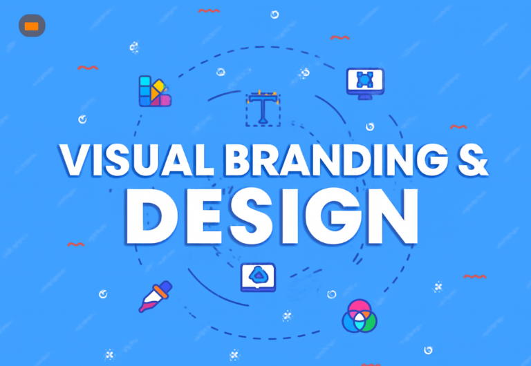
Mastering Visual Branding & Design: Crafting a Cohesive Visual Language
Introduction
Visual design is so much more than just a pretty face for websites, apps, or physical products—it’s the backbone of an exceptional user experience (UX). It’s easy to overlook, but the way a design looks and feels can deeply influence how users interact with digital products. It affects everything from first impressions to user behavior, and, in the end, it can make or break the success of a platform.
In this article, we’re diving into the core principles of visual design, including how color and typography set the mood, and how a user-centered design ensures the product isn’t just eye-catching, but functional and usable too. We’ll explore the ins and outs of Brand Digital Design Systems and Brand Motion Language, showing how even the tiniest visual elements—like Brand Typography Hierarchy or Brand Interactive Elements —can dramatically enhance user engagement and drive conversions.
We’ll also look at how modern trends and technologies are shaping visual design, proving that good design is not just about beauty, but purpose. Stick around as we explore how these principles shape user experience (UX) and how they are critical to the success of digital products. Let’s get started with the magic of Visual Design

The Core Principles of Visual Design
Visual design isn’t just about making things look good—it’s about creating a meaningful and functional experience for the user. A few key principles guide this process, helping designers deliver a product that’s both visually appealing and easy to use. Let’s break them down:
- Balance
Balance in design is all about making sure everything feels just right. Whether it’s symmetrical, where everything is evenly distributed, or asymmetrical, where elements are placed in a more dynamic way, balance ensures the design feels stable. Think of it as creating a sense of order on a page, with no part feeling too heavy or too light. Tools like core Branding Grid Systems help designers keep things in check, ensuring content is placed in a well-organized manner. - Contrast
Contrast is what keeps your design from being flat. It’s the tool designers use to draw attention and make content easy to digest. Whether through color, size, or font choices, contrast helps differentiate elements. A light background with dark text is a classic example for readability, while contrasting colors can highlight important actions, like buttons or links. It’s also key in maintaining a consistent Brand Digital Design System, where the visual identity stays strong across platforms. - Hierarchy
Hierarchy is like a roadmap for your user’s eyes. It’s how we guide their attention to what’s most important, first. By playing with size, color, and positioning, designers can make sure the user sees the most critical information upfront, followed by supporting details. This is especially crucial in Brand Typography Hierarchy, where font sizes and styles speak volumes about which content deserves the spotlight. - Alignment
Alignment is the invisible glue that keeps everything together. It ensures that all the elements—whether text, images, or buttons—are lined up neatly, creating a clean, organized look. When everything is aligned, the page feels cohesive, and it helps the user’s eyes flow naturally through the content. It’s all about creating a smooth path for the viewer to follow. - Repetition
Repetition isn’t just for emphasis; it’s a tool that helps create consistency. Repeating certain elements like colors, fonts, or Brand Illustrative Assets can reinforce your core branding and help the user get familiar with the design. It also makes navigating the page easier because the user starts recognizing patterns and knowing what to expect.
“Design is not just what it looks like; design is how it works.” – Steve Jobs.
When these principles come together, they create designs that are not only beautiful but intuitive. The best designs don’t just look good—they work well too, ensuring a seamless and enjoyable experience for the user.

The Role of Color in Visual Design
Color is far more than just a decorative element in design; it’s a powerful tool that can shape emotions, influence behavior, and guide decision-making. When used correctly, color can elevate the user experience, spark specific feelings, and reinforce a brand’s identity. On the flip side, poor color choices can lead to confusion, frustration, and disengagement.
The psychology of color is fascinating and plays a vital role in Brand Color Psychology. Different hues evoke different emotional responses that influence how people perceive a brand. For example, blue is often seen as calming and trustworthy, which is why it’s widely used in financial and tech industries. Red, with its bold intensity, grabs attention and creates a sense of urgency—ideal for calls to action. Green connects strongly with health and wellness, while purple conveys luxury and creativity. Through thoughtful Brand Photography Curation and carefully structured Brand Grid Systems, designers can align visuals with these emotional triggers. Applying Brand Texture Guidelines and innovative Brand Virtual Staging ensures that every element reflects the desired tone. This approach supports Brand Visual Activation, where colors, textures, and layouts come together to create memorable experiences. Ultimately, following a Brand Design Consistency Playbook allows businesses to maintain harmony across touchpoints while making color choices that perfectly align with their brand message.
Color also plays a key role in Brand Adaptive Imagery, where colors are adjusted across different devices. This ensures that a brand’s visual identity remains consistent whether users are on mobile, desktop, or other platforms. This adaptability keeps the experience seamless and cohesive, no matter where it’s viewed.
“Colors influence people’s behavior and emotions in subtle ways, so the right color choice can enhance engagement.” – Color Psychologist.
But color isn’t just about looking good; it’s about making the design functional and easy to use. For example, contrasting colors for buttons and links make them stand out and easier to click. A well-chosen color palette for text, background, and icons can also improve readability and help reduce visual clutter, making the user experience smoother.
Typography: Crafting Readable and Impactful Text
Typography is a key player in visual design—it’s about much more than picking a stylish font. It’s about choosing the right fonts, sizes, and spacing that all come together to make the text easy to read and engaging. The decisions you make with typography can completely shape the tone of your content and, ultimately, how users interact with your page.
Legibility is the top priority. The font you choose should be easy on the eyes, especially on smaller screens like mobile devices. Designers often debate between serif and sans-serif fonts. Serif fonts have those little lines at the ends of each character, giving them a classic, traditional feel. They’re common in print. Sans-serif fonts, on the other hand, are sleek and modern, and they’re usually the go-to for digital designs because they’re so clean and easy to read on screens.
Then there’s typographic hierarchy—this is how designers make sure readers can easily spot headings, subheadings, and body text. By playing with font sizes, weights, and styles, designers can direct the reader’s attention to the most important information first, ensuring a smoother reading experience.
“Typography is the voice of the written word. It sets the tone and builds trust.” – Typography Expert.
Another essential element is line spacing. The space between lines of text is just as important as the words themselves. Proper spacing prevents the text from feeling cramped and makes the whole page more inviting. Too little space can make it hard to read, while too much space can disrupt the natural flow of the content.
When done right, typography makes a design look polished and professional. A well-thought-out typographic system not only improves readability but also enhances the visual appeal of the page, creating a better overall user experience.
User-Centered Design: Focusing on Functionality
User-centered design (UCD) is all about putting the user at the center of the design process. The aim is to create products that don’t just look great but also function smoothly and intuitively for the people who will use them. To achieve this, designers must really understand the target audience—their behaviors, needs, and challenges.
A successful UCD process relies heavily on incorporating user feedback through usability testing and research. By seeing how real users interact with the design, designers can pinpoint areas that need improvement and make smarter choices about layout, navigation, and overall functionality.
Accessibility is one of the most important principles in UCD. A good design should be accessible to everyone, including people with disabilities. This means thinking about things like color contrast for users with visual impairments, making sure text is easy to read, and adding alternative text for images, so no one is left behind.
Another key part of UCD is usability—creating designs that make it easy for users to achieve their goals quickly and efficiently. If a design is too complicated or cluttered, it can overwhelm users, leading to frustration and possibly even abandonment. A great user interface should feel natural, guiding users through the experience with minimal effort.
“Design isn’t just about what looks good; it’s about making something that works beautifully for users.” – UX Designer.
When it comes to Brand User Interface Patterns, consistency is crucial across all digital platforms. Familiar UI elements—like buttons, navigation menus, and forms—help users feel confident and comfortable as they navigate the design.

Trends in Visual Design: Evolving Aesthetics
Just like any creative field, visual design is always evolving. New tools, emerging technologies, and shifts in user behavior continually shape how designers approach their craft. Trends like minimalism, the rise of dark mode, and the introduction of 3D design elements are a few examples of how the world of visual design is constantly in flux.
Minimalism is one of the most powerful design trends today. The focus is on simplicity, cutting out unnecessary elements to leave only what’s essential. This not only makes designs feel cleaner but also boosts the user experience by reducing distractions and clutter. Minimalist designs often use white space strategically, giving the page room to breathe and creating a sense of openness. Websites and apps that embrace minimalism often feature large, impactful images, clean typography, and easy-to-navigate layouts.
Dark mode has become another game-changer. It offers a sleek, modern look and is often easier on the eyes, especially in low-light environments. But it’s more than just a cool aesthetic—it’s also about functionality. Many users find that dark mode helps reduce eye strain during long screen sessions, making it a more comfortable choice for extended browsing or working. Designers have jumped on board, offering users the flexibility to choose their preferred mode for a more personalized experience.
Then there’s Brand Animation Guidelines, which are becoming a big influence in interactive design. Subtle animations can guide a user’s attention and make a website or app feel more dynamic and engaging. They add an extra layer of interactivity that helps keep users hooked and creates a richer experience.
“Trends come and go, but the best designs are those that remain functional and timeless.” – Senior Designer.
While it’s tempting to dive headfirst into every new design trend, it’s important for designers to strike a balance. Trends like minimalism and dark mode are great tools when used in the right context, but they shouldn’t come at the expense of usability or brand identity. The goal is to incorporate trends that complement the design’s overall objectives and truly enhance the user experience.

Visual Design for Mobile and Responsive Web Design
In today’s digital world, mobile-first design is no longer just a trend—it’s essential. With the rise of smartphones and tablets, a significant chunk of web traffic comes from mobile devices. This shift has made responsive design a priority for designers. Responsive design ensures that a website or app adapts seamlessly to any screen size, giving users an optimal experience no matter what device they’re using.
Mobile-first design is all about focusing on mobile devices before expanding to desktop screens. Since mobile devices have limited space, designers need to prioritize what’s most important—content and layout. This means simplifying the design for smaller screens, while still making sure everything functions smoothly. The result? Faster load times, better performance, and a more intuitive experience for users on the go.
At the heart of responsive web design is the idea of fluid layouts. These layouts adjust to different screen sizes, from mobile phones to large desktop monitors. By using flexible grids, resizing images, and CSS media queries, responsive design ensures that content is easy to read and navigate on any device. For example, a website might shift from a multi-column layout on a desktop to a single column on a mobile phone, making the content much easier to digest.
When designing for mobile, user interactions are key. Buttons, navigation elements, and form fields need to be large enough to tap comfortably, while maintaining a clear and easy-to-follow structure. Responsive typography also plays a big role, making sure that text adjusts in size to remain readable across devices, from the tiniest phone screen to a wide desktop monitor.
“Responsive design ensures your content is accessible on any device, improving user retention and satisfaction.” – Mobile Designer.
The real challenge of mobile-first and responsive design is finding the right balance between aesthetic appeal and functionality. While it’s tempting to fill a design with eye-catching elements, it’s important that these don’t compromise usability. The goal is to create designs that are not only beautiful but also fully functional, delivering an excellent experience on any device.

The Future of Visual Design: AI and Machine Learning in Design
The future of visual design is set to be shaped by the rapid advancements in artificial intelligence (AI) and machine learning. These technologies are transforming the way designers approach their craft, offering exciting new tools for automation, personalization, and even the creative process itself.
One of the most promising ways AI is making waves in design is through design automation. Powered by machine learning algorithms, AI tools can sift through huge amounts of data to predict design trends and user preferences. This allows AI to suggest color palettes, layouts, and typography based on user behavior. These tools can also generate multiple design variations in no time, freeing designers up to focus more on creative thinking and less on repetitive tasks.
Personalization is another area where AI is having a big impact. AI allows websites and apps to deliver custom-tailored experiences based on individual preferences, behaviors, and previous interactions. For instance, AI might adjust a site’s layout, suggest content, or even change color schemes depending on things like time of day or a user’s past behavior, making the experience feel much more personal and dynamic.
Moreover, AI is improving collaboration between designers and clients. With AI-powered tools, designers can receive real-time feedback, optimize design elements, and ensure that their designs meet both aesthetic and functional goals. AI can analyze usability metrics and suggest ways to improve, which helps speed up the design-to-launch cycle and delivers better results faster.
“AI won’t replace designers, but it will revolutionize how we approach design tasks.” – AI Specialist.
While AI is a powerful tool in design, it’s important to note that it won’t replace human creativity. Designers will still be essential for crafting meaningful and unique experiences, but AI will make the design process quicker, more efficient, and more responsive to user needs.
Conclusion
Visual design is so much more than just making things look nice—it’s about crafting engaging, effective, and user-friendly digital experiences. By mastering design fundamentals and embracing trends like color theory, typography, and responsive design, designers can create experiences that truly resonate with users and drive real results. As we move further into a mobile-first world, the role of thoughtful, user-centered design will only become more essential.
With powerful tools like Brand Digital Design Systems, Brand Environmental Signage, and Brand Materiality, designers can ensure a brand’s visual presence stays consistent and authentic across all platforms. By integrating Brand Retail Fixtures and Brand Artisanal Elements into physical spaces, and telling compelling stories through Brand Collateral Storytelling and Brand Motion Language, designers can foster meaningful connections with users. This holistic approach ensures that a brand’s identity is not only seen but truly felt by its audience.
FAQ
1. What are the key principles of visual design?
The core principles of visual design include balance, contrast, hierarchy, alignment, and repetition. These principles ensure that designs are aesthetically pleasing and easy to navigate, providing a solid foundation for both form and function.
2. How do color choices impact user experience?
Color plays a significant role in shaping user emotions and behaviors. The right colors can enhance the user experience by reinforcing brand identity, creating visual hierarchy, and improving readability, while the wrong color choices can lead to confusion or disengagement.
3. What makes good typography in design?
Good typography ensures that text is legible, readable, and visually appealing. Key aspects include selecting appropriate fonts, creating a clear hierarchy, and ensuring proper line spacing. Typography should also reflect the tone and purpose of the content.
4. Why is responsive design important?
Responsive design is crucial because it ensures that a website or app provides an optimal experience across all devices. With the increasing use of mobile devices, responsive design ensures that users can easily access and interact with content, regardless of screen size.
5. How will AI influence the future of design?
AI is revolutionizing the design process by offering automation, personalization, and optimization tools that assist designers in creating more efficient, tailored, and data-driven designs. AI tools can speed up repetitive tasks, but designers will remain essential for ensuring creativity and human-centric experiences.