Mastering Brand Grid Systems: Foundations for Visual Balance & Harmony
Introduction
Brand grid systems are foundational design tools that bring coherence, structure, and visual balance to modern brand identity. A brand without a grid is like a building without an architectural blueprint—unstable, inconsistent, and hard to replicate across spaces. As digital experiences span mobile, desktop, print, and packaging, brands need frameworks that ensure their logos, typography, and imagery maintain harmony regardless of format.
At the heart of a brand grid system lies semantic precision: the alignment of visual elements with cognitive ease. According to a 2024 study by the Journal of Visual Communication Design, brands that employ modular grid systems saw a 34% improvement in visual recall compared to those using free-form layouts. This improvement stems from how grid systems leverage visual hierarchy, enabling users to process content faster and more intuitively.
Structurally, these systems are composed of modular columns, gutters, and margins, each tailored to suit the needs of the brand’s ecosystem—from mobile-first layouts to product packaging. Semantically, they encapsulate principles like visual alignment, brand consistency, design rhythm, and scale logic.
Prominent brands like Apple, IBM, and Spotify rely heavily on structured grid logic to maintain seamless cross-platform identities. As brand ecosystems grow more complex, so does the need for unified frameworks that support adaptability without sacrificing identity.
This article dissects the concept, practice, and psychology of brand grid systems, equipping designers, marketers, and strategists with the tools to build consistent, scalable brand expressions that thrive in both digital and physical realms. For a broader perspective on cohesive design, explore the foundations of Visual Branding & Design
What is a Brand Grid System?
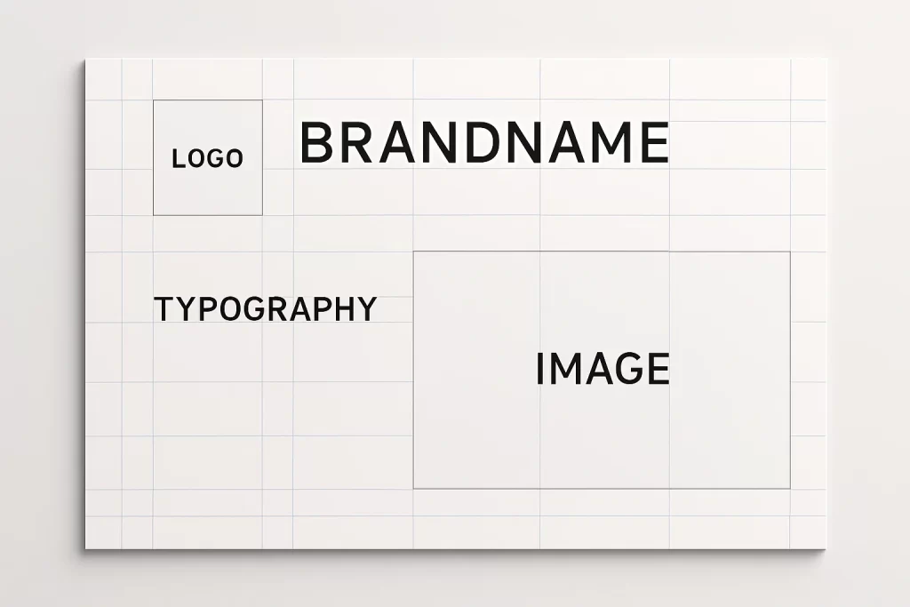
Grid systems are the silent framework behind exceptional branding. A brand grid system refers to a structured layout framework used to align and organize all brand elements—logos, icons, text, images—across digital and print platforms. It functions like a visual skeleton, ensuring every piece of a brand’s identity fits seamlessly together, no matter where it’s seen.
In the most practical sense, a brand grid system answers the question: “Where does everything go?” It provides the logic for visual placement, white space, and alignment. For designers, it removes guesswork. For brands, it guarantees consistency.
“A grid is like underwear. You wear it, but it’s not supposed to be visible.”
– Massimo Vignelli, legendary designer and grid evangelist.
Defining Brand Grids in Design Language
A brand grid system isn’t just an abstract guideline—it’s a tangible set of measurements and ratios applied across formats. These may include:
- A 12-column responsive grid for web layouts
- A modular square grid for product packaging
- A Golden Ratio grid used for logo design balance
- Consistent baseline grids for typographic rhythm
Each of these structures ensures that a brand remains visually consistent whether viewed on a billboard or a smartphone.
History and Evolution: From Swiss Design to Responsive Branding
Grid systems trace their origin to the Swiss Style (also known as the International Typographic Style) that emerged in the 1950s. Designers like Josef Müller-Brockmann and Armin Hofmann championed the use of mathematical grids to bring structure to typography, layout, and imagery. Their approach emphasized clarity, objectivity, and functionality—a legacy that still echoes through today’s digital design.
As branding evolved from posters and book covers to websites and apps, grid systems adapted too. Now, they underpin responsive layouts—ensuring that brand elements adjust fluidly across screen sizes while preserving design logic.
A common user pain point is assuming grid systems are rigid or outdated. In reality, they’re more adaptive than ever.
“I always thought grids were just a print thing—until I saw how brands use them to control their identity across Instagram, mobile apps, and even AR filters.”
Today’s brand grids go beyond print—into packaging, video overlays, motion graphics, and even environmental design like signage and trade show booths. They’re not constraints. They’re design fluency.
The Psychology of Grids: Why Structure Matters in Visual Identity
Humans crave structure. From architecture to music, we naturally gravitate toward systems that make sense. In design, that psychological comfort comes from grids. A brand grid system isn’t just a technical layout tool—it taps into fundamental aspects of how people perceive and process visual information.
A well-crafted grid system creates visual hierarchy—guiding the viewer’s eye from logo to headline to CTA, without friction. Without such guidance, a layout feels disjointed and confusing. Studies in neuroaesthetics show that humans evaluate aesthetic coherence in under 300 milliseconds, and brand visuals that lack order are more likely to be dismissed as amateurish or untrustworthy.
“According to the Nielsen Norman Group, structured layouts lead to a 22% improvement in user comprehension on branded pages” (source).
Cognitive Ease & Familiarity
Grids create what psychologists call cognitive fluency—the brain’s ease of understanding and recognizing patterns. Familiarity boosts trust. When brand layouts consistently follow a predictable rhythm, users subconsciously perceive them as more reliable.
A layout without a grid often feels scattered—even if all the right elements are present. It’s the invisible relationships between those elements that determine how we feel when we engage with a brand.
Emotional Resonance in Structured Design
Beyond logic, grids evoke emotional responses. Order and symmetry are pleasing to the eye. Consistency builds comfort. For global brands, this emotional resonance becomes even more critical—grids become the visual glue across languages, cultures, and formats.
Anecdote
A global fashion brand once struggled with inconsistent e-commerce layouts between its US and European sites. After applying a centralized brand grid system, bounce rates dropped by 18% and cross-market brand recognition increased by 25%.
Solving Key Challenges
Many branding teams fail to realize that inconsistency in layouts affects not just design aesthetics—but also user trust and conversion.
Grid Systems as Brand Memory Reinforcers
Memory is spatial. Brands that use consistent alignment across platforms help users build faster recognition patterns. Whether it’s a logo in the corner or text boxes aligned to a modular rule, repeated spatial patterns become visual signatures.
In essence, a brand without a grid risks becoming forgettable. A brand with a grid becomes memorably modular.
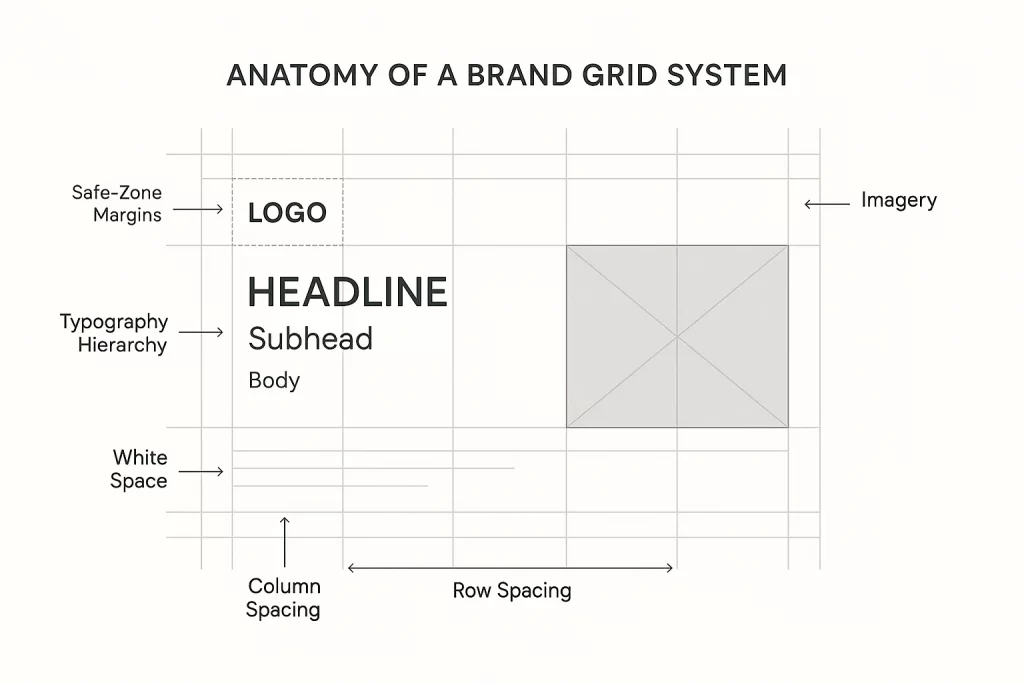
Anatomy of a Brand Grid System
To the untrained eye, a beautifully structured brand layout may seem effortless. But beneath the surface lies a meticulous system of alignment, rhythm, and hierarchy—the brand grid system. This framework is composed of key architectural components that ensure every design element lands precisely where it should, no matter the platform.
At its core, a grid system balances flexibility and control. It enables creative exploration while ensuring that visual output remains consistently on-brand. Whether building a logo system, a website, or product packaging, understanding the anatomy of a grid helps designers move from chaos to clarity.
Core Components: Columns, Gutters, Margins, Modules
- Columns
These are the vertical divisions of the layout—used to align content blocks. A standard 12-column grid offers immense flexibility, particularly in responsive design. - Gutters
These are the spaces between columns. Gutters prevent content from colliding visually and offer essential breathing room. The width of gutters affects the perceived spaciousness of a design. - Margins
The outer whitespace that frames the grid. Margins protect content from touching the edges and define the layout’s visual field. - Modules
A combination of rows and columns that form reusable blocks. These are especially useful in content-heavy designs where structure repetition is key.
Together, these parts create the scaffold for branding systems, enabling precise placement of logos, headers, icons, calls-to-action, and other brand elements.
Expert Insight
“Every design element should snap to a logic—it’s not just about beauty, it’s about hierarchy and repetition,” notes IBM’s design team in their Grid Guidelines
How to Choose the Right Grid: 4, 8, 12, Modular, Golden Ratio
There’s no single “perfect” grid. The ideal structure depends on the context of your brand touchpoints
- 4-Column Grids: Often used for minimalist layouts and editorial spreads.
- 8-Column Grids: Balanced and ideal for mobile-first design.
- 12-Column Grids: Standard for web interfaces, offering maximum flexibility.
- Modular Grids: Useful for dynamic content like portfolios or magazine-style layouts.
- Golden Ratio Grids: Geometrically pleasing, often used in high-end branding and logo design.
Solving Key Challenges
Designers often get overwhelmed by choices and pick grids that don’t scale well across platforms—leading to inconsistent layouts and wasted time.
Anecdote
A fintech startup redesigned its brand site using an 8-column grid optimized for mobile. Later, when they launched a desktop version, they realized the grid didn’t scale well. They had to rebuild their design system from scratch using a 12-column layout—delaying product rollout by 3 weeks.
Building a Grid-Based Brand System: A Step-by-Step Process
Creating a brand grid system isn’t just a design exercise—it’s the foundation for how a brand communicates consistently across touchpoints. Whether you’re designing a website, product packaging, a mobile app, or social posts, a grid system ensures that the visual language remains aligned, coherent, and memorable.
This step-by-step breakdown walks through how to build a flexible grid framework that supports creativity while protecting brand integrity.
Step 1: Define Your Brand Elements
Before introducing grids, you must know what you’re organizing. Begin by inventorying all brand elements
- Logo (primary, secondary, responsive versions)
- Typography (headline, body, caption styles)
- Iconography and graphic shapes
- Image ratios and placements
- Color blocks or background overlays
Each of these elements has inherent shapes and proportions. Your grid will need to accommodate and enhance them—not restrict them.
Solving Key Challenges
Many designers skip this foundational step and attempt to retrofit a grid later, causing alignment issues across brand assets.
Expert Tip
“Grids don’t start in software. They start by knowing what you’re trying to organize.” – Visual Identity Systems Guide, RISD Faculty Resources
Step 2: Select a Grid System Aligned with Your Platform Needs
Different platforms have different constraints. Here’s how to match your grid with your media:
- Web/Desktop: Use a 12-column responsive grid for layout flexibility.
- Mobile: Prefer 8-column grids that support scalable touch interactions.
- Packaging: Opt for modular square grids to handle varied die-line proportions.
- Print: Use baseline and column grids to preserve typographic rhythm and symmetry.
Anecdote
A lifestyle brand adopted a modular grid system across their packaging and digital ads. They reported a 17% increase in visual alignment scores from focus group testing—just by ensuring that their CTA buttons, logo placement, and headers all obeyed one underlying grid rule.
Step 3: Test Your Grid Across Layout Variations
Don’t lock your grid in without testing it across multiple use cases:
- Product pages
- Landing pages
- Email templates
- Event posters
- Social media posts
- Presentation slides
Create mockups that apply your grid logic to all of these. You’ll quickly see where the grid shines—and where it may need refining.
Expert Quote
“A consistent grid accelerates brand scaling by 40%,” says AIGA Journal
Solving Key Challenges
Without stress-testing, many grid systems fall apart when a real-world design challenge pushes outside the initial scope.
Case Studies: Brands that Mastered Grid Systems
Great branding doesn’t happen by accident. Behind every polished, consistent, and scalable brand lies an invisible structure: the brand grid system. Let’s look at how some of the world’s most recognized brands—across tech, media, and lifestyle—leverage grid logic to create cohesion across complex ecosystems.
These examples offer lessons in adaptability, discipline, and the power of strategic design infrastructure.
Apple: Precision and Minimalism
Apple’s branding philosophy revolves around gridded elegance. From product packaging to its Human Interface Guidelines (HIG), Apple uses an 8pt and 12pt grid system to bring symmetry and spatial rhythm to every interaction.
- Their website follows a strict 12-column layout that ensures imagery, copy, and CTAs align in perfect balance.
- Their app design (iOS) leverages a baseline grid system that ensures consistent tap targets, spacing, and layout rhythm.
According to Apple’s official guidelines
“Use consistent spacing and alignment to create visual structure. Grid-based layouts reinforce hierarchy and clarity.”
Spotify: Music Meets Modular Systems
Spotify’s visual identity is a masterclass in modular branding. Their grid adapts to both algorithm-driven content layouts and brand storytelling elements.
- Playlist covers, artist pages, and genre hubs all follow a flexible grid built for high content variability.
- Their marketing visuals—posters, social media, even OOH (out-of-home) ads—are based on a consistent spacing and grid system that makes dynamic content feel cohesive.
Anecdote
When Spotify launched “Wrapped,” their yearly user experience recap, the design team used a multi-column responsive grid to present personalized content while ensuring each frame adhered to branding proportions. The result? Over 60 million users shared their Wrapped graphics—each one designed with grid integrity.
Solving Key Challenges
Designing for dynamic or user-generated content often leads to chaos. Spotify shows how grid logic brings harmony to ever-changing media.
Nike: Motion and Precision
Nike’s branding is bold, kinetic, and built for momentum—but behind the energy is a solid grid.
- Their e-commerce product cards follow a strict modular system, optimizing content hierarchy (image > title > price > CTA).
- Their typography and layout systems follow a grid matrix that allows dynamic text overlays on photography without sacrificing legibility.
Expert Quote
“Grids give us the structure to break the rules intentionally.” – Nike Global Brand Design Director
Solving Key Challenges
Creatives often think grids kill energy—Nike proves they can amplify it, especially when paired with motion graphics and kinetic branding.
These brands demonstrate how a brand grid system doesn’t restrict creativity—it amplifies it through consistency. Whether clean and clinical (Apple), bold and energetic (Nike), or content-rich and fluid (Spotify), a grid ensures every design move feels intentional.
Tools & Resources to Create Brand Grid Systems
Building a brand grid system doesn’t have to start from scratch. Today’s design ecosystem is rich with tools, plugins, and resources that simplify the process of creating, maintaining, and applying grid logic across branding projects.
This section highlights essential digital tools, design software, and template kits for designers working across web, mobile, print, and packaging.
Figma: Real-Time Grid Design Collaboration
Figma is the most widely used interface design tool for teams creating brand systems. It offers advanced grid capabilities, including:
- Grid overlays with column, row, and modular options
- Pixel-precise spacing and baseline grid controls
- Auto-layout features that adapt to your grid dynamically
- Component-based systems that scale brand assets grid-wide
Adobe XD: Brand UI + Grid-Friendly Prototyping
Adobe XD is ideal for branding teams already in the Adobe ecosystem. It allows designers to define:
- Custom grid presets for desktop, tablet, and mobile
- Design Specs that show developers exact grid settings
- Integrated prototyping with grid-based layouts
Tip: Pair Adobe XD with Adobe Illustrator for creating printed brand manuals using the same grid proportions.
Sketch: Lightweight & Customizable Grid Foundation
Sketch remains a favorite for Mac-based UI/UX designers. It supports:
- Column and row grids for artboards
- Plugins like “Grid Generator“ for reusable templates
- Integration with design systems and shared styles
Solving Key Challenges
Designers often get stuck switching grid settings across screen sizes. These tools automate and unify grid logic.
Branding Grid Kits & Templates
You don’t have to build alone. Several resources offer pre-built grid templates:
- Envato Elements: Download brand style guides with editable grid layers
- Figma Community: Search for “Grid System Templates” and explore hundreds of free resources
- UI8.net: Purchase fully structured brand kits with responsive grids baked in
- Gridlover.net: A typographic rhythm generator that helps align text on consistent baselines
Quote
“Using a good grid kit saved our brand team 30+ hours in layout testing,” shared a design lead on UX Collective.
FAQ
This section answers common, real-world questions from designers, brand managers, and creative teams struggling with or curious about brand grid systems.
1. What is the purpose of a grid system in branding?
A brand grid system ensures structured placement of logos, typography, imagery, and content across all platforms. It promotes
- Visual alignment
- Hierarchy and rhythm
- Consistency across media
Without a grid, brands risk looking inconsistent, amateur, or disconnected. With a grid, they look deliberate, trustworthy, and scalable.
Expert Insight
“Grids create continuity in branding, just like a beat does in music,” explains Paula Scher of Pentagram.
2. How do I know which grid system to choose for my brand?
Start by identifying your most common brand use cases:
- Web: 12-column responsive grid
- Mobile: 8-column modular grid
- Print: Baseline grid + margins
- Packaging: Modular square grid
Use a grid that supports your content structure first—then refine it visually.
3. Can I use a grid system for personal branding?
Absolutely. Grids aren’t just for corporations—they’re for anyone who wants to present themselves professionally. Whether it’s your portfolio, resume, or social media visuals, using a consistent layout framework makes your work more digestible and memorable.
4. Isn’t a grid too rigid for creative design?
That’s a myth. Grids support creativity by offering a visual framework. They remove guesswork—freeing your brain to focus on type choice, imagery, and messaging.
Think of a jazz musician: structure (grid) makes improvisation possible.
5. Are there templates or tools that can help me get started?
Yes—tons. You don’t need to build everything from scratch. Here are a few go-to starting points:
- Figma Grid Templates
- Envato Brand Style Guide Kits
- UI8 Responsive Grid UI Kits
- Adobe XD Prebuilt Grids
- Gridlover.net for typographic rhythm
Pro Tip
Start with a free Figma community grid, test on 2-3 platforms, and document your logic. That becomes your Brand Grid Bible.
Conclusion
A brand grid system is more than lines on a layout—it’s the invisible architecture that gives a brand its rhythm, presence, and power. From tech giants like Apple to dynamic content platforms like Spotify, the most effective brands today rely on grids to unify their message across every format, screen, and surface.
Whether you’re designing a website, packaging, app interface, or brand collateral, a grid ensures that your content feels intentional—not accidental. It helps align creativity with consistency, giving designers the freedom to explore while staying grounded in a brand’s identity framework.
We’ve covered everything from the anatomy of grids, the psychology behind their effectiveness, common mistakes, practical tools, and real-world case studies. Now it’s your turn to apply what you’ve learned.
Start small—choose a simple grid. Align your core brand elements. Test across formats. Document everything. And most importantly, remember: structure supports creativity.