Illustrative Assets in Branding: Visual Storytelling that Resonates
Introduction
In a world saturated with visual stimuli, brand illustrative assets emerge as critical storytelling vehicles that not only inform but deeply connect. A consistent body of scientific and marketing literature affirms that humans process visuals 60,000 times faster than text and retain 80% of what they see, compared to 10% of what they hear and 20% of what they read. These metrics underscore a crucial truth: in branding, visual memory isn’t just a tool—it’s a competitive edge.
Illustrative branding—through custom illustrations, character designs, and narrative visuals—taps into this cognitive science. These assets synthesize identity, values, and narrative into forms that transcend language. Brand illustrative assets are not decorative; they are structural. They form the architecture of how a customer first feels a brand, not just sees it.
Take the example of Mailchimp, whose bold and humorous brand illustrations differentiate it in a saturated SaaS space. Their mascot, Freddie, isn’t merely a graphic—it’s a visual persona that carries tone, personality, and brand emotion. This is the difference between graphic decoration and illustrated storytelling.
Most brands face the challenge of visual sameness. Design teams default to stock vectors or logo-only assets that feel cold, mass-produced, and easily replicable. This creates what designers call “brand anonymity”—where even a well-funded product gets lost in the crowd because nothing in its visuals sticks.
For those looking to better understand how visual coherence can be achieved, this guide on Visual Branding & Design offers foundational insights into building cohesive brand visuals.
This article dissects how custom illustrative assets in branding drive real ROI—by boosting brand recall, building emotional resonance, and improving conversion rates through story-powered visuals. It will map out asset types, creation workflows, style systemization, and real-world case studies. Readers will gain a framework for elevating their brand’s visual language into a scalable, expressive storytelling system.
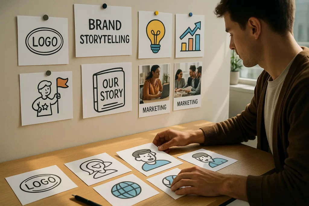
Why Illustrative Assets Matter in Brand Storytelling
Storytelling in branding has moved beyond copywriting and slogans. Today, brands communicate just as much through illustration systems as they do through words. Whether it’s a friendly character, an emotive icon set, or a metaphorical infographic, brand illustrative assets form the bridge between abstract brand values and visual interpretation.
Visual storytelling for brands is not new—but what’s evolved is how vital it has become in standing out. A 2023 Nielsen Norman Group study found that users form an opinion about a brand’s trustworthiness in just 0.05 seconds, and visuals are the primary driver in that blink. Brands that depend solely on photography or generic icons risk blending into the aesthetic fog of the internet.
Illustrative brand identity elements allow companies to show, not just tell. For example, Duolingo’s green owl, Duo, isn’t just a mascot; it’s a visual thread that connects onboarding, push notifications, error messages, and product updates. Through facial expressions, poses, and props, the owl tells the story of the brand’s tone: fun, irreverent, persistent. It evokes emotion, builds trust, and fuels user engagement.
Customer Challenges: Generic Visuals Undermine Brand Trust
One of the most common complaints among brand managers is that the visual system feels disconnected or impersonal. This is usually the result of defaulting to pre-built vector packs or templated visuals that carry no emotional brand illustration.
Expert John Maeda, former Head of Computational Design at MIT, once said:
“Design is about communication. If illustration isn’t communicating something essential and differentiated, then it’s just decoration.”
That single quote captures the critical line between pretty visuals and strategic assets.
Semantic Wins
- Custom brand illustrations feel authentic, tailored, and emotionally resonant.
- Illustrated branding creates metaphors, not just designs.
- Illustrative storytelling increases brand memorability and helps simplify complex value propositions.
- Brands with consistent visual stories tend to have higher NPS scores, according to CXL Institute.
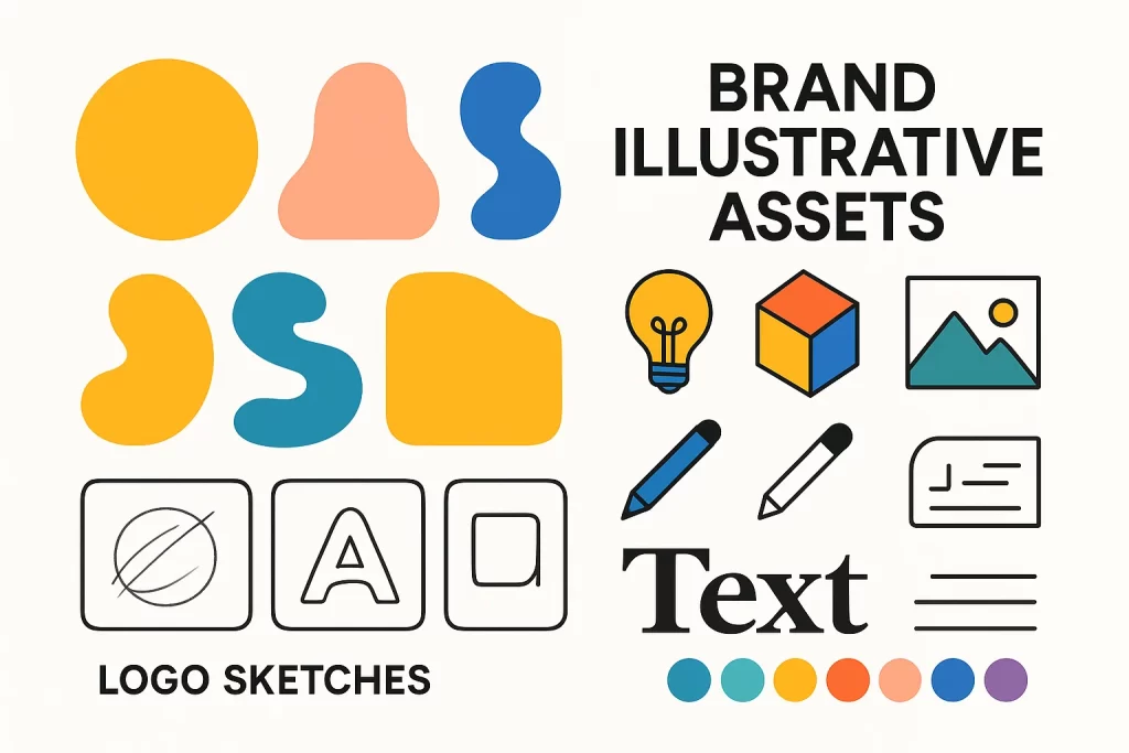
Types of Illustrative Assets & Where to Use Them
Brand illustration is not a monolith. It’s a spectrum of asset types, each with its own role in conveying tone, guiding behavior, or reinforcing memory. Brands that understand the functional diversity of illustrative assets can better tailor their use to each customer touchpoint—leading to stronger visual storytelling and greater design efficiency.
Whether it’s an animated explainer, a small icon on a dashboard, or an onboarding illustration that greets new users, each asset contributes to a cohesive brand experience. Here’s a breakdown of the most effective illustrative brand identity elements and where to deploy them:
Icons & Glyphs
Summary
Icons are micro-assets that pack a lot of meaning into small spaces. They serve as functional guides—improving UX while reinforcing brand tone.
Use Case
- Web navigation
- App UIs
- Feature lists
- Service tiers
Customer Challenges Solved
Brands often use mismatched icon packs that visually clash with their color palette or style. This inconsistency breaks user trust.
Expert Quote
“Icons should be seen as part of a brand’s visual vocabulary, not just UI flourishes.” – Eva Moolchan, Visual Design Director at Intercom.
Mascots & Character Illustrations
Summary
Mascots give your brand a soul. These recurring characters serve as spokespeople, emotional anchors, and content narrators.
Use Case
- Onboarding sequences
- Explainer videos
- Brand social media
- Error pages
Customer Challenges Solved
Many startups attempt to “add fun” with one-off illustrations but fail to build a character system that evolves with the brand.
Anecdote
A fintech app saw a 40% increase in tutorial completion rates after replacing static text with a mascot-led onboarding series.
Patterns & Background Motifs
Summary
These are decorative but strategic assets—used for packaging, websites, internal collateral, or as backdrop visuals in social content.
Use Case
- Website backgrounds
- Packaging design
- Banners and posters
- Email headers
Customer Challenges Solved
Brands often rely too heavily on photography for visual interest, leaving pages feeling cold or too commercial.
Infographics & Editorial-Style Illustration
Summary
These illustrations are used to visualize processes, frameworks, or data—bridging logic and emotion.
Use Case
- Blog content
- Case studies
- Investor decks
- Social carousels
Customer Challenges Solved
Dry statistics fail to engage or convert unless they are contextualized visually.
Expert Insight
“When numbers become characters, they get remembered. Illustrated infographics can increase comprehension by up to 60%.” – Visual Learning Research Council
Each type of illustrative asset plays a role in a larger brand illustration system. Understanding their purpose—and where they naturally belong—allows you to use them not just as ornaments, but as strategic communication tools.
Developing an Illustrative Asset System (Style Guide)
Creating one-off illustrations is relatively easy. But building an illustrative asset system—a unified language of consistent visuals—is a strategic endeavor. It’s the difference between painting a wall and designing a full architectural blueprint. Without structure, even the most beautiful illustrations will feel disjointed, unscalable, or worse, off-brand.
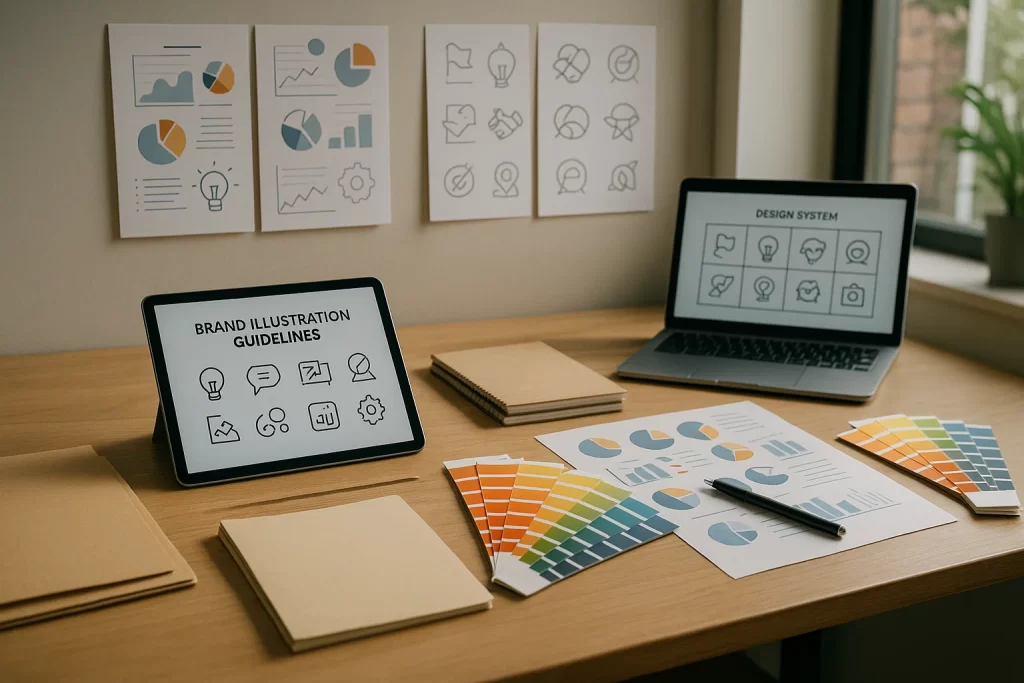
A brand illustration style guide ensures that visual elements are used correctly and consistently across all platforms—whether it’s your homepage, packaging, mobile app, or TikTok feed. It brings order to creativity.
Core Components of an Illustrative Style Guide
Here’s what an effective illustrative brand system should include:
- Character Design Rules
- Include size ratios, expression ranges, and emotional cues.
- Define visual tone: playful, serious, minimal, bold.
- Line Weight & Stroke Style
- Should all illustrations use monoline? What’s the max variation?
- Color Palette Rules
- Should illustrations follow the brand color palette or introduce secondary hues?
- Define base, accent, and neutral tones.
- Perspective & Depth Guidelines
- Flat 2D? Isometric? Layered scenes?
- Clarify lighting logic and shadow behavior.
- Use Cases & Placement Logic
- When to use characters vs icons vs patterns
- Guide for mobile vs desktop sizing
- Export Formats & Naming Conventions
- Include SVG, PNG, and source files like AI or PSD
- Use clear file structure for teams
Customer Challenges: Inconsistency Hurts Brand Recognition
When brands skip this step, the result is chaos. One campaign features thick-line illustrations, another uses pastel scribbles, and a third imports trendy—but unrelated—graphics. The brand becomes visual noise. Worse, your audience starts confusing your content with competitors using similar styles.
A visual identity must evolve, yes—but with governed creativity. Having rules doesn’t limit expression; it empowers consistency across teams, freelancers, and markets.
Expert Insight
“Your illustration system is like a band’s sound—it can grow, but it needs recognizable rhythm. Otherwise, the audience stops listening.”
— Marta Ryczko, Illustrator & Brand Designer at Shopify
Pro Tip
Start small. You don’t need 50 rules out of the gate. Begin by documenting what’s already working in your brand visuals. Then build your system iteratively.
Process: From Brief to Final Illustrative Asset
A great illustration isn’t just art—it’s a collaboration. Behind every polished brand asset is a journey of discovery, alignment, iteration, and refinement. When brands lack a defined process for developing brand illustrative assets, the result is miscommunication, scope creep, and visuals that feel disconnected from the brand voice.
Let’s walk through a battle-tested creative pipeline that aligns marketing strategy, design systems, and brand storytelling—so that every asset feels intentional.
1. Define the Objective
Start with clarity. What is the goal of this asset?
- Communicate a product feature?
- Reinforce a brand emotion?
- Simplify a complex idea?
Without this foundation, even the best art direction will fail. Tie it back to KPIs like engagement, click-through rate, time-on-page, or onboarding completion.
2. Gather Strategic Inputs
Compile these for your illustrator
- Creative brief : context, audience, channel
- Brand guidelines : color palettes, fonts, mood
- Competitor visuals : what to avoid
- Inspirational references : tone and texture
- Illustration system specs : line style, perspective, constraints
3. Sketch & Conceptualize
Illustrators should begin with low-fidelity sketches. This step invites feedback without emotional attachment—clients feel safe suggesting changes, and the visual conversation starts.
4. Review & Iterate
Present sketches with context. Explain how each visual direction supports the brand’s storytelling objectives.
Tip: Avoid comments like “make it pop.” Instead, reference specific tone attributes (e.g., “can we make this more assertive like our tone of voice on landing pages?”).
Customer Challenges
Designers often feel like clients are indecisive. Clients often feel designers “don’t get it.” Solving this requires visual dialogue early, not just pretty finals late.
5. Digitize & Vectorize
Once approved, move to vector execution in Illustrator, Figma, or Procreate.
Best practices
- Use clean paths and layers
- Avoid raster artifacts
- Ensure scalability (e.g., icons should be legible at 16px)
6. Apply & QA the Asset
Drop the final artwork into real brand environments. Does it hold up on dark backgrounds? In grayscale? At small sizes?
This step often surfaces micro issues like overlapping lines, color bleeding, or odd scaling.
7. Deliver & Archive Strategically
Bundle final files by use-case:
- Social (PNG + SVG)
- Print (300DPI, CMYK)
- App/UI (responsive variants)
- Editable source (AI, PSD)
Include naming conventions and folder structure. This prevents future teams from recreating the wheel—or worse, Googling a stock workaround.
Case Studies: Brands That Nail Illustrative Storytelling
Nothing illustrates the power of brand illustration better than seeing it in the wild—how real companies use visuals not just as aesthetic flair but as strategic communication systems. These brands understand that great illustration goes beyond being “cute” or “on-trend.” It tells a story, embodies a tone, and becomes part of the product’s memory.
Let’s explore three compelling examples that showcase the range and ROI of well-executed illustrative branding systems.
1. Mailchimp: The Power of Persona-Based Illustration
Mailchimp didn’t just use illustration—they built their entire brand voice around it. Freddie, their quirky monkey mascot, became the brand’s emotional ambassador. Whether delivering a successful campaign message or warning about an error, Freddie carried the same irreverent, approachable tone the brand is known for.
Illustration Tactics Used
- Custom mascot with emotional expressions
- Consistent line work and color palette
- Context-aware use (e.g., celebrating milestones vs. warning of problems)
Impact
According to a case study published by Fast Company, Mailchimp’s brand redesign (anchored in illustration) boosted their user retention by over 30% within the first year.
2. Dropbox: Abstract Illustration as a Visual Language
Dropbox’s redesign in 2017 leaned hard into abstract illustrative elements—a bold move for a file-sharing app. The aim? To differentiate themselves from sterile enterprise competitors and express creativity, collaboration, and openness.
Illustration Tactics Used
- Editorial-style vector illustrations
- Blobby, hand-drawn shapes with dynamic color overlays
- No outlines, irregular proportions—embracing imperfection
Impact
While the initial launch was polarizing, it fueled a 70% increase in brand mentions across design forums and sparked thousands of conversations, elevating Dropbox’s perception from “utility tool” to “creative platform.”
Customer Challenges Solved
Differentiation in a crowded market
3. Headspace: Calm, Consistency, and Character
Headspace’s illustrations mirror its product: soft, empathetic, emotionally intelligent. Every animation, landing page, and social post features the same plump, rounded characters and serene color palette. These visuals don’t shout—they soothe.
Illustration Tactics Used
- Pastel-toned characters with closed eyes and gentle movements
- Organic, rounded edges across all assets
- Micro-animations in apps to ease transitions
Impact
Internal UX reports (referenced by Product Coalition) noted a 20% increase in user task completion rates within the app, directly linked to improved visual feedback via illustrations.
Expert Insight
“Illustration is how we deliver kindness at scale.” – Headspace Lead Designer
Best Practices & Common Pitfalls
Creating beautiful brand illustrations is only half the battle—maintaining clarity, consistency, and usability is what makes those illustrations effective across all touchpoints. Inconsistent or poorly thought-out illustrative assets can lead to confusion, break brand trust, or worse—create friction in the user experience.
Below are critical best practices and the most common mistakes to avoid when building your illustrative brand identity system.
1. Anchor Every Illustration in Brand Strategy
Each illustration should map to a business goal—whether it’s to simplify onboarding, add charm to a landing page, or humanize your product.
Ask: What does this asset communicate beyond visual appeal?
2. Maintain Visual Consistency Across All Assets
Define rules for line thickness, color palette, character expressions, and spacing. Stick to them—even across departments or design teams.
Pro Tip: Create a “rule-breaker doc” that outlines when and why you can flex the rules for campaign exceptions.
3. Design for Scalability
Icons and illustrations should look just as crisp on a billboard as they do on a mobile screen.
Test your assets at multiple sizes before deployment.
4. Use Illustration to Guide, Not Distract
Every visual should serve a purpose. Whether guiding user attention or reinforcing tone, illustration must support, not steal, the show.
“The best illustration is invisible—it communicates before you notice it.” – Mads Jakobsen, Design Lead at Notion
5. Audit Asset Usage Quarterly
Visual systems drift. Schedule audits of your live assets across web, app, social, and email to maintain alignment.
Use automated visual diff tools or Figma plug-ins to help identify off-brand elements.
Common Pitfalls to Avoid
Inconsistent Character Behavior
Changing how your mascot smiles or interacts across assets breaks emotional continuity. Define a character emotion chart early.
Over-Illustrating Everything
Not every brand element needs a custom illustration. Use them where they add value—key user journeys, high-stakes messaging, or moments of friction.
Ignoring Cultural Context
Certain gestures, colors, or symbols may have different meanings globally. Validate assets through localized user testing.
Using Illustration as a Last-Minute Add-On
Treat illustration as part of product strategy, not post-production. If you bolt it on, it won’t align.
FAQ
1. How much do custom brand illustrations typically cost?
Pricing varies based on complexity, format, and experience of the illustrator. For one-off assets, expect:
- Icons: $50–$150 each
- Mascots: $500–$2,000
- Full brand systems: $3,000–$20,000+
Agencies often bundle these into larger visual branding packages.
2. Can I use hand-drawn assets in e‑commerce product pages?
Absolutely. Hand-drawn elements can soften the clinical feel of digital shopping experiences and boost perceived authenticity. Illustrated trust badges, product instructions, or even doodle-like pointers have shown to increase conversions.
“We swapped our techy UI icons for hand-drawn ones—checkout conversion improved 8%.” – Growth Manager at an apparel brand
3. What’s the difference between stock illustrations and branded illustration systems?
- Stock: One-size-fits-all visuals, often reused by thousands of sites. Cheap but generic.
- Branded systems: Custom-created, tailored to your message, and cohesive across all platforms. They build identity, not just fill space.
4. How long does it take to develop a complete illustration system?
Timelines depend on the scope. Here’s a rough guide:
- 1–2 weeks: Icons or spot illustrations
- 4–6 weeks: Mascot with full expressions
- 6–12 weeks: Full brand illustration system with guide
Time also depends on feedback rounds, internal approvals, and usage complexity.
5. Where can I learn how to brief designers for illustrative assets?
Start by clearly defining
- The emotion you want to evoke
- Where the asset will be used (web, mobile, print)
- Visual references (what to emulate vs avoid)
- File format requirements (SVG, PNG, etc.)
You can also read guides like this one on briefing creative teams.
Conclusion
In a digital ecosystem overloaded with generic visuals and templated interfaces, brand illustrative assets offer a way for companies to reclaim originality, human connection, and strategic distinction. More than just decorative elements, illustrations function as visual storytellers—conveying brand personality, simplifying complexity, and guiding user emotion.
Whether it’s a mascot that welcomes users into your product, a custom icon set that communicates functionality, or a background motif that echoes your core values, illustrations have the power to turn interactions into relationships. And unlike fleeting trends, a well-crafted illustration system can scale across time, mediums, and audiences—anchoring your brand identity in something recognizably yours.
But success doesn’t come from random acts of design. It’s earned through:
- Strategic intent
- Visual consistency
- Deep user empathy
- Clear creative processes
- An evolving, documented system
So if your current visuals feel disconnected, overly templated, or emotionally flat—it might be time to invest in illustration not as art, but as asset. Audit what you’ve got. Map what you need. And start sketching a visual language that sells not just the product—but the story behind it.