Adaptive Imagery for Branding: Techniques for Seamless Experiences Across Devices
Introduction
In today’s fractured attention economy, Brand Adaptive Imagery is no longer optional—it’s a strategic imperative. As users engage across mobile, desktop, smartwatches, or dark mode browsers, brands must respond with visual systems that are not only consistent but contextually responsive. Scientific studies in human-computer interaction confirm that emotionally congruent visual environments can increase cognitive processing fluency and brand recall by over 30%.
This evolution in Visual Branding & Design hinges on a central concept: visual identity systems must adapt without diluting core meaning. That means designing dynamic assets that evolve based on device type, time of day, or even user behavior—all while staying true to a brand’s DNA.
Semantic triples throughout this article demonstrate how adaptive brand imagery → supports brand recognition → across multi-platform touchpoints. We’ll explore how dynamic identity elements function as adaptive design variables, how responsive visual identity systems scale across ecosystems, and how brands are leveraging tools like Figma and Octopus to do it right.
From implementation workflows to visual tone automation, this article offers strategic and technical insight for teams looking to future-proof their digital brand presentation with scientifically grounded, user-centered design.
Why Adaptive Imagery Matters: From Confusion to Cohesive Branding
As brand ecosystems grow across devices and contexts, the visual experience often fractures—logos get clipped, typography scales poorly, and visual tone shifts unintentionally. This inconsistency chips away at trust, confuses users, and undermines brand recognition.
That’s where Brand Adaptive Imagery steps in. By designing flexible visual branding systems that respond to context—whether screen size, light mode, or user segment—brands can unify their digital brand presentation without sacrificing creativity.
A Figma research paper revealed that teams using adaptive image systems observed a 24% increase in engagement and a 17% improvement in brand consistency metrics. These numbers aren’t just design vanity—they reflect cognitive ease and message retention at scale.
“We used to rely on rigid templates, but now our visuals shift automatically between campaigns. It’s helped our UX and branding alignment enormously.” — Senior Brand Designer, SaaS company (from Figma’s Adaptive Toolkit insights)
For many teams, the fear is technical overload. But with the right system and smart defaults, adaptivity can be effortless and elegant. Brands no longer need to choose between beauty and responsiveness. The future is both.
Explore how tools like the Figma Adaptive Toolkit allow designers to set conditions—like “if mobile, use variant X”—for dynamic brand imagery that looks intentional everywhere.
Brand Responsive Design isn’t about one-size-fits-all. It’s about strategic variation built on a shared core. This ensures that users, regardless of channel, perceive the brand as coherent, professional, and intuitive—every time.
Technical Foundations: Implementing Adaptive Imagery Without Overwhelm
For many branding teams, the idea of adaptive brand imagery triggers a wave of anxiety: “Will I need to code this?”, “How do I scale it?”, “Will it break on older browsers?”
But with the right tools and a modular mindset, dynamic brand imagery is not only achievable—it’s repeatable, scalable, and relatively low-lift.
Let’s break it down:
1. Start with Variable Design Assets
Design systems should begin with identity systems for brands that contain variant-ready components. For example, logos should be designed in stacked, horizontal, icon-only, and dark/light variants. Tools like Figma now support auto-variants and conditional component swapping based on device or screen width.
2. Use Conditional Logic with Design Tools
Adaptive imagery doesn’t require writing JavaScript from scratch. No-code tools like Octopus.tools allow you to map “if this, then that” behavior to image containers. For instance:
- If dark mode → use alternate color palette
- If screen width < 600px → use mobile hero image
- If e-commerce checkout → show product-specific illustration
“According to Figma’s Adaptive Toolkit documentation, designers saw a 30% improvement in asset consistency using auto-adaptive variants.”
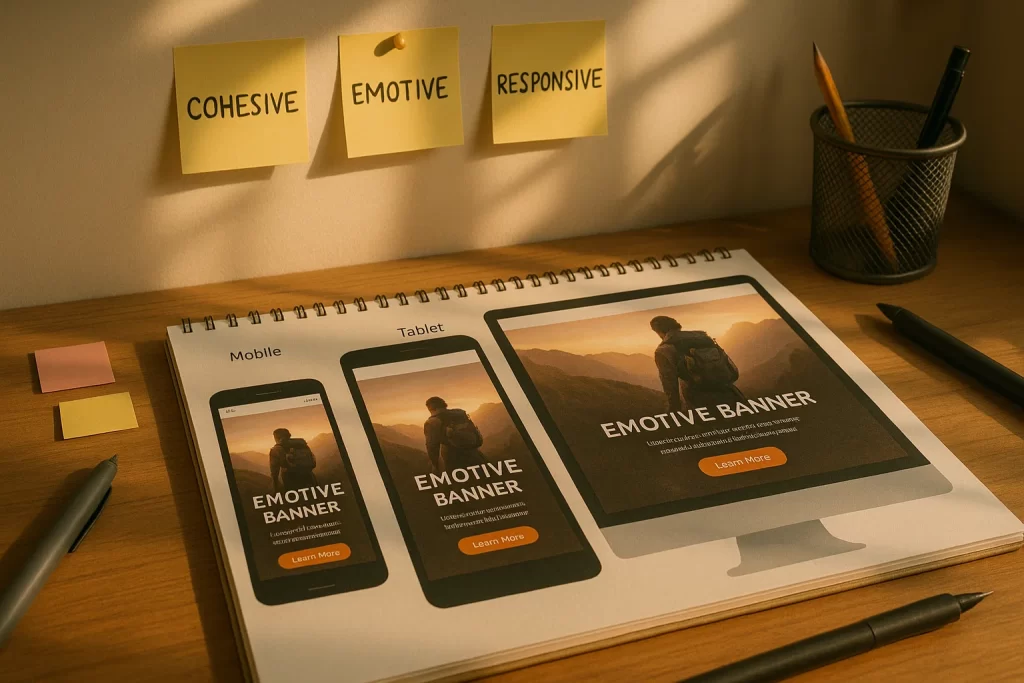
3. Responsive Formats Matter
Don’t ignore the technical underpinnings. Use srcset, picture elements, and SVGs for crisp, resolution-agnostic rendering. Proper responsive visual identity systems for mobile and web ensure sharp delivery, not blurry scaling.
4. Centralized Asset Control
A digital asset management (DAM) system like Bynder or Brandfolder helps enforce consistency. Assets can be tagged by channel, audience, or mood—then dynamically fetched.
By reducing decision fatigue and automating context-aware selection, adaptive brand imagery empowers small teams to deliver enterprise-level consistency.
This is the heart of Visual Branding & Design in 2025: not static grids, but living systems that know where they are and who they’re for.
Designing for Consistency Across Channels
Consistency is the cornerstone of brand trust—and in an age of infinite devices and formats, it’s also the hardest thing to maintain. Many designers struggle with ensuring a seamless experience between email banners, mobile apps, websites, social ads, and printed assets. Even minor inconsistencies in icon sizing, alignment, or tone can dilute brand equity.
So how do brands achieve brand responsive design without creative rigidity?
Establish Core Design Tokens
Start with semantic design tokens—small, centralized values for things like color, spacing, and typography. These should not be hardcoded by platform but referenced dynamically across tools. Whether it’s a web banner or an Instagram story, the token “brand-accent-color” should mean the same #FF5733 orange—everywhere.
Platforms like Style Dictionary and Figma Variables make this achievable even for lean design teams.
“We used to recreate colors manually for each channel. Now, our tokens ensure pixel-perfect consistency from TikTok to our app UI,” says Leena Mohanty, a brand systems strategist featured in Smashing Magazine.
Template Responsiveness, Not Just Output
Instead of designing fixed templates, brands are now building adaptive brand imagery modules—hero sections, CTAs, product cards—that reshape automatically. This mirrors the concept of “component-driven UI” in frontend development, applied to visual branding.
Example: A testimonial block might:
- Show star ratings and quote for mobile
- Expand to include video and logo on desktop
- Shift tone and layout for B2B vs. B2C audiences
Channel-Specific Context Awareness
Each platform has behavioral cues. Social users skim fast. Mobile readers swipe with thumbs. Print readers linger longer.
Your flexible visual branding system should adapt accordingly:
- Bigger CTA buttons for mobile
- Denser content for tablets
- Simplified layout for email
Anchor the Identity, Flex the Presentation
Think of your brand’s visual identity as a spine. The bones (color, typography, logo behavior) stay stable, but the muscles (imagery, motion, spacing) flex based on channel.
This flexibility enhances perceived cohesion, reduces user confusion, and minimizes designer errors—a win for everyone involved.
Smart Adaptivity: Context‑Aware Visuals & Emotional Tone
Branding is no longer a static statement; it’s a responsive conversation. In today’s hyper-personalized landscape, dynamic brand imagery must reflect not just the device a user is on—but their mindset, emotional state, and behavior patterns.
What Is Smart Visual Adaptivity?
Smart adaptivity means tailoring visual assets—colors, imagery, motion, layout—based on real-time data such as:
- Time of day (light/dark tone shifts)
- User segment (first-time vs. returning)
- Location (local event visual overlays)
- Mood (based on content or past behavior)
Brands like Spotify and Airbnb already do this with UI personalization. Now, visual identity is catching up.
“Research from design.gov shows that visuals that subtly shift based on browsing context can boost emotional resonance by up to 25%.”
This isn’t manipulation—it’s relevance. When your visuals respond naturally to user context, the brand feels alive, thoughtful, and intuitive.
Tools Enabling Emotionally-Aware Imagery
- Octopus.tools can ingest behavioral signals (like session length or engagement patterns) to swap illustrations or palettes.
- AI-based platforms such as Runway or Uizard allow condition-based image generation at scale.
- Design systems like Figma Variables can trigger color and layout shifts based on toggled states—such as mood filters or accessibility settings.
Use Case Example
Let’s say your site promotes sustainable fashion:
- Morning visitors see bright, hopeful lifestyle images
- Evening visitors are shown calming, muted visuals
- High-engagement returners see curated product visuals tied to their browsing history
These subtle visual shifts reinforce emotional tone without overwhelming users.
Addressing the Fear: “Will It Feel Disjointed?”
The key is cohesion. Identity systems for brands must define adaptive boundaries: how much flexibility is allowed before the brand becomes unrecognizable?
That’s where semantic guardrails come in. Motion speed, border radius, lighting tone, image subject types—these should vary within pre-defined limits, maintaining core identity while offering room to flex.

When executed correctly, adaptive brand imagery doesn’t feel like change—it feels like intuition. Like the brand understands where you are, what you need, and how you feel.
Tools and Templates: Scaling Adaptive Visual Branding
Creating adaptive brand imagery is one thing—scaling it across campaigns, countries, platforms, and teams is another. This is where most brands stumble. Without structured systems, things fall apart: mismatched templates, off-brand visuals, broken hierarchy.
But with the right tools and templates, scaling doesn’t have to mean compromising.
Why Scale Matters
Brand experiences today happen at velocity. You need 10 social variants for a launch, 3 web banners for localization, 1 email header in dark mode—all delivered by Tuesday. Manual design workflows buckle under this pressure.
Flexible visual branding systems need smart automation and repeatable components.
The Modern Tool Stack
- Figma Adaptive Toolkit
Figma’s community-driven adaptive components allow variant logic built into the design file. Think: auto-updating hero banners, logo positioning, and content blocks for responsive use.
Try the Figma Adaptive Toolkit to build adaptive UI with condition-bound components.
- Octopus.tools
Think Zapier meets visual identity. This low-code platform lets you define conditional rendering logic—”If user is in dark mode, show illustration B.” It connects asset libraries with behavioral inputs. - Adobe’s Brand Templates
Adobe Express and Adobe XD offer brand-locked templates. Designers can generate dynamic variations without altering locked tokens—preserving brand consistency across teams.
Adobe Blog’s case study on this reveals 40% faster turnaround in multi-channel brand campaigns using locked template kits.
- Brandfolder / Bynder (DAM Systems)
Store and tag adaptive visual components for use in global campaigns. Use metadata like “platform:mobile,” “persona:B2B,” or “tone:celebratory” to filter and serve the right version.
Smart Template Design Principles
- Design assets in sets, not singles (e.g., light, dark, icon-only, animated)
- Use conditional tokens that change layout or behavior by channel
- Centralize documentation for naming conventions, logic rules, and fallback visuals
From Brand System to Visual OS
Adaptive design at scale isn’t a side project—it’s your visual operating system. When tools are integrated, templates are smart, and team roles are clear, your brand doesn’t just look consistent—it acts intelligent.
Case Studies: Real‑World Examples of Adaptive Visual Identity
Concepts are helpful—but execution is everything. Let’s look at real-world brands leveraging responsive visual identity systems for mobile and web to great effect. These examples demonstrate how brand adaptive imagery creates visual coherence, emotional connection, and functional design across devices.
1. Spotify Wrapped — Visuals that React to User Data
Spotify’s “Wrapped” campaign is a masterclass in dynamic brand imagery. It auto-generates personalized visuals using user data—listening history, top genres, time spent—all styled with Spotify’s distinctive palette and typographic DNA.
- Adaptive Elements:
- Layouts change by data volume
- Colors shift to match listening mood
- Mobile vs. desktop variants
- Brand Benefit:
Each shareable visual reinforces Spotify’s identity and tells the user’s unique story. No two Wrapped graphics are identical—but they’re all unmistakably Spotify.
2. Airbnb — Contextual Imagery by Locale
Airbnb’s homepage dynamically changes background visuals and iconography based on user location and season. A user in Japan sees cherry blossoms; someone in Sweden sees cozy winter cabins.
- Adaptive Techniques:
- IP-based image swaps
- Semantic theming (colors, tone)
- Responsive layout adjustments
- Outcome:
Emotional resonance and higher click-through rates on property categories during seasonal promos.
3. Headspace — Emotionally Responsive UI
Mental wellness brand Headspace uses adaptive brand imagery to reflect user mood and context. Their UI and visuals lighten up as users complete milestones or engage more frequently.
- Features:
- Mood-based color changes
- Adaptive illustrations reflecting user engagement
- Dark/light shift for time-of-day
“After shifting to adaptive visuals, we saw a 20% uptick in daily session starts,” reported in an Adobe/Headspace case study.
Lessons from the Field
- Use modular visual systems—small elements can be swapped, not rebuilt
- Context doesn’t have to mean hyper-personalization; even time or location-based imagery creates value
- Balance flexibility with brand guardrails—consistency matters more than novelty
Adaptive identity systems are not theoretical—they’re a proven advantage. When done right, they tell a consistent story that shifts naturally based on user context and behavior.
Step-by-Step Workflow: From Planning to Launch
Many teams hesitate to adopt adaptive brand imagery because it feels too complex or ambiguous. But with a structured approach, building a responsive visual identity system becomes a manageable, even repeatable, process.
Here’s a 6-step framework to implement brand adaptive imagery strategies for digital presence—without the chaos.
Step 1: Audit Your Current Visual Assets
- Identify static elements causing inconsistency across channels.
- Note inconsistencies in logos, hero images, UI components, and iconography across platforms.
- Use tools like Figma’s inspect feature or Zeplin to track variations.
Goal: Understand where your visuals break down—especially on mobile, dark mode, or print.
Step 2: Define Your Core Identity System
- Establish semantic tokens: color values, font hierarchies, spacing, motion speeds.
- Create asset variants: horizontal/stacked logos, alt-color backgrounds, mobile CTAs.
- Set brand guardrails: what can and can’t change dynamically.
“Most brands fail here—not because of design, but because of undefined rules,” notes UX Director Claire Hall on Smashing Magazine.
Step 3: Choose Your Adaptive Tools
- Use Octopus.tools for condition logic (e.g., if mobile = use variant X).
- Implement Figma Variables for toggles and adaptive previews.
- For teams, connect with Bynder or Brandfolder for scalable asset serving.
Step 4: Design Adaptive Templates
- Build smart layouts that respond to screen width, user state, or mood.
- Use breakpoints to set layout rules inside tools like Figma or Adobe XD.
- Preview visual changes live—across dark/light modes, device sizes, and languages.
Step 5: Test in Context
- Load adaptive visuals in real environments (e.g., mobile dark mode, email clients).
- Check for “visual whiplash”—where branding feels disconnected from the rest of the site.
- Run user feedback loops: “Does this feel like our brand across touchpoints?”
Step 6: Launch, Measure, Iterate
- Roll out adaptive visuals in a contained campaign (e.g., seasonal landing page).
- Use analytics to track image engagement, consistency scores, and click-through rates.
- Refine templates based on real performance, not gut instinct.
“Adaptive isn’t about perfection—it’s about responsiveness and evolution,” shared a product designer on Reddit. “What mattered was that we started and iterated.”
By following these steps, teams move from reactive asset creation to proactive visual branding systems that scale.
FAQ
1. How to maintain brand consistency with adaptive visuals across platforms?
Consistency starts with defining brand constraints—like typography, color palette, and layout grid—and then allowing controlled flexibility. By using tools like Figma Variables and semantic tokens, you can ensure that changes across devices remain stylistically coherent.
“I always worry that what looks great on desktop won’t match my mobile branding…” — said one brand designer on Reddit.
The solution? Design adaptable systems, not standalone templates. That way, variations are deliberate, not chaotic.
2. What tools can help build responsive visual identity systems for mobile and web?
Several platforms support adaptive design logic:
- Figma Adaptive Toolkit for condition-based component swapping
- Octopus.tools for connecting visuals to context-aware triggers
- Brand asset managers like Bynder or Brandfolder for distributing adaptive assets at scale
These tools help automate consistency across responsive visual identity systems for mobile and web.
3. Techniques for adaptive brand identity in 2025—where do I even start?
Begin by:
- Auditing your current visuals
- Defining adaptable elements
- Using conditional tools like Octopus
- Creating templates with fallback logic
- Testing on real devices
This article’s workflow section breaks down how to approach each of those in detail.
4. Will adaptive imagery tools make my brand inconsistent?
Not if you use them strategically. Adaptive tools are only as powerful as the design system behind them.
Without defined constraints, yes—variations can spiral. But with a well-structured identity system for brands, you get scalable consistency.
Conclusion
As the digital landscape diversifies, brands face a choice: remain static or evolve into fluid, responsive systems that meet users where they are—visually, emotionally, and contextually.
Brand Adaptive Imagery isn’t just a trend. It’s a foundational shift in how visual branding systems are designed, delivered, and experienced. From context-aware visuals that adjust for tone and time, to scalable design templates that power campaigns across the globe, adaptive design is the new baseline for coherence, clarity, and creativity.
The key isn’t in having more assets—it’s in having smarter ones. With the right tools, structure, and mindset, your brand can become not just consistent, but intuitively adaptive.