Designing Brand-First User Interface Patterns for Memorable Digital Experiences
Introduction
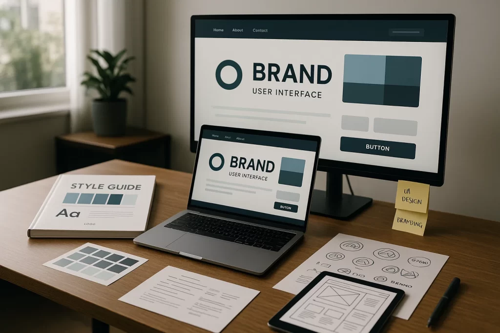
In the digital ecosystem, where users interact with hundreds of apps and websites every day, brand differentiation is vital. Brand user interface patterns form the visual and interactive backbone of a product’s identity, enabling a seamless marriage of aesthetics and usability. When executed correctly, these patterns create a signature look and feel that reinforces brand trust, recognition, and emotional connection.
This all falls under the broader discipline of Visual Branding & Design, where visual consistency across platforms elevates perception and usability simultaneously.
“According to Nielsen Norman Group, consistent branding across interfaces increases user trust by up to 30%.”
But users often face disjointed experiences when design decisions are made in silos. A user might see a beautifully designed homepage, only to encounter clunky, off-brand modals and forms elsewhere. This fragmentation erodes brand trust and usability.
This pain point was voiced repeatedly on platforms like Reddit and UX forums:
“We spent six months redesigning our landing page, but forgot the dashboard. Now it feels like two different products.” — UX Reddit thread
Fragmentation like this not only breaks brand cohesion but can affect conversions and user satisfaction metrics. Your UI is more than pixels—it’s your brand’s digital handshake.
A successful brand-first UI strategy addresses three critical pillars:
- A clear articulation of brand principles (tone, mood, values)
- Visual implementation of these through repeatable design patterns
- A system to enforce and evolve these patterns across the product lifecycle
Investing in a consistent, branded UI isn’t just about looking polished; it’s about strategic differentiation in a saturated market.
Core Principles of Brand-Driven UI Patterns
Designing a truly brand-aligned interface starts with codifying foundational principles that inform every interaction. These principles act as a compass that guides all UI decisions, ensuring that your product experience doesn’t just function but also feels unmistakably yours.
Consistency and Familiarity
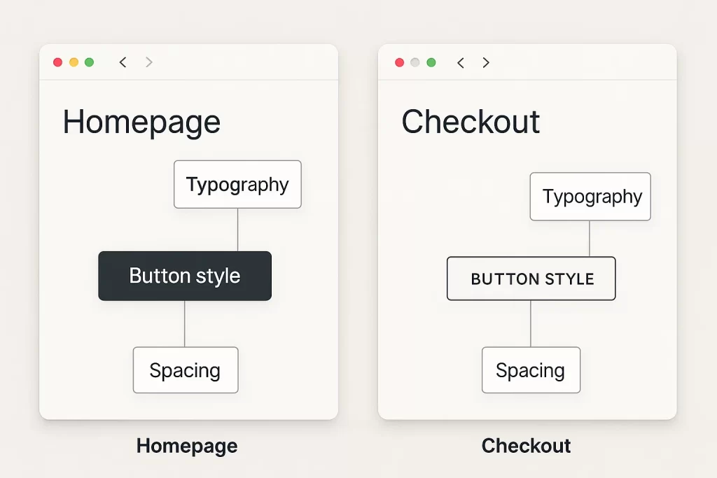
Consistency builds trust. Whether it’s the button shape, shadow style, or font weight, repeated use of design elements reinforces user confidence. Familiarity makes interfaces feel intuitive—users shouldn’t have to relearn behaviors from one screen to the next.
For example, if your primary action buttons are rounded with shadow accents on the homepage, the same styling must apply in modals, dashboards, and mobile views. Inconsistent use of spacing, iconography, or tone leads to disjointed brand perception.
Designing familiar flows also respects user expectations. While creativity is essential, abandoning established patterns without reason can disorient users. Instead, layer brand uniqueness on top of predictable interaction logic.
Distinctiveness and Identity
This principle ensures your product doesn’t fade into the sea of sameness. Distinctiveness is achieved through the use of signature visual elements and interaction styles rooted in your brand strategy.
Consider Mailchimp’s playful brand voice visualized through quirky illustrations and offbeat animations. Or Dropbox’s minimalist shapes and thoughtful whitespace. These are not just aesthetic choices—they are intentional, identity-driven patterns.
Designers can embed distinctiveness through:
- UI branding motifs: unique button shapes, scroll patterns, or hover states
- Illustrative iconography: reflecting brand tone (e.g., playful, corporate, avant-garde)
- Microcopy voice: infusing brand tone into CTAs and error messages
Ask yourself: if your logo were removed, would users still recognize the product as yours?
Scalability and Flexibility
Brand-first UI patterns must evolve alongside your product. Scalability ensures that new features can be introduced without eroding the existing design system. This is where design tokens, component modularity, and reusable branded UI elements become critical.
A scalable UI system:
- Has clearly defined tokens for spacing, colors, and states
- Supports dark/light modes and responsive layouts
- Anticipates edge cases without design debt
Flexibility means that as your brand tone matures (e.g., from startup-friendly to enterprise-ready), your design system can reflect that evolution without a complete visual overhaul.
A scalable and flexible UI pattern ensures longevity, adaptability, and brand continuity across platforms—from web to wearable.
Building Your Brand UI Pattern Library
A strong UI pattern library acts as the operational center of your brand identity in product design. It enables design and development teams to work more efficiently, maintain visual harmony, and scale consistently.
Audit Your Current UI Inventory
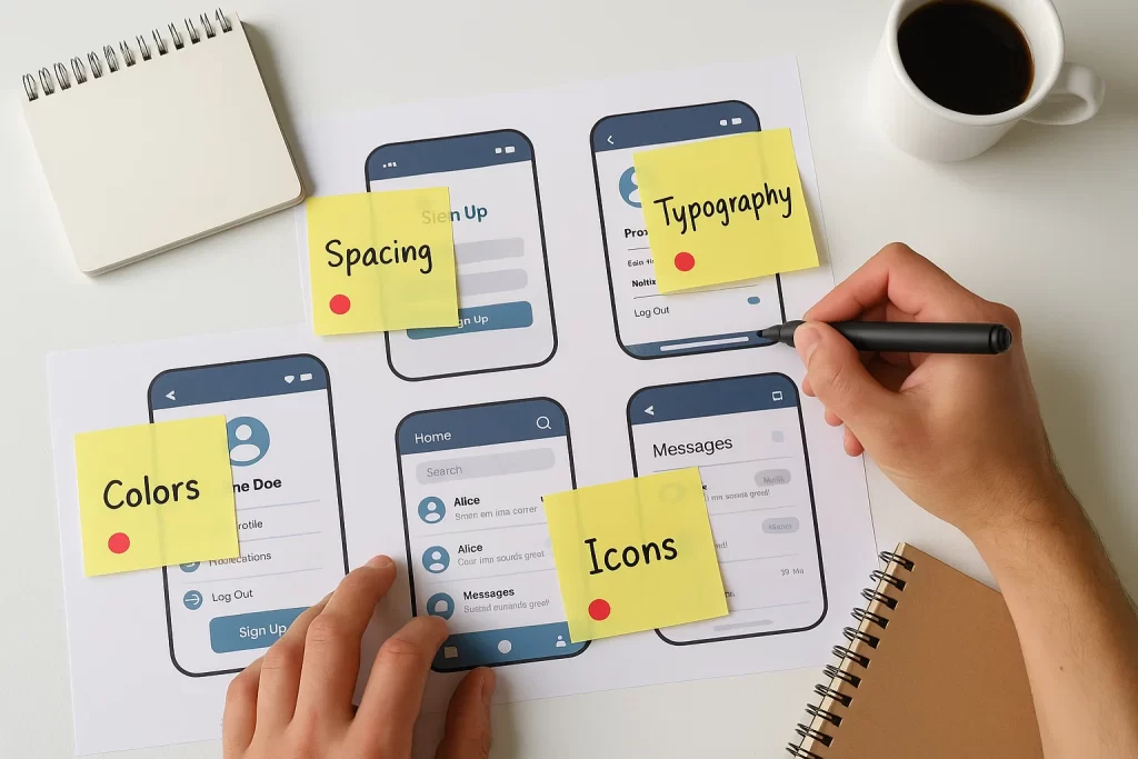
Start with a comprehensive audit. This means cataloging every button, modal, form field, tooltip, and icon used across your app, site, or platform. Identify the visual inconsistencies: Are some buttons using a different radius? Are headings aligned differently on mobile than on desktop?
Use collaborative tools like Figma, Zeplin, or UXPin to tag and comment on these components. Tools like Figma variables and zeroheight documentation can help you trace lineage between tokens and components.
This step reveals how fragmented or cohesive your current design really is. It also builds empathy across teams—developers and marketers can see what inconsistencies users face daily.
Define Brand Tokens and Core Elements
Once the gaps are clear, move into defining your design tokens. These are the atomic building blocks of your system:
- Color tokens: primary, secondary, error, success, disabled
- Typography: heading levels, font families, letter spacing, line heights
- Spacing: padding, margins, grid systems
- Elevation and shadows: for depth and interactivity
Every component you build must reference these tokens—not just to maintain consistency, but to future-proof your design. Changing a token value (e.g., brand color) should cascade through the entire system without manual rework.
Also define tone-based UI elements: hover states, animations, transition speeds—all of which speak to your brand’s personality.
Scale via Design System Principles
To scale effectively, shift your mindset from static templates to living systems. A design system goes beyond a component library; it includes principles, documentation, governance, and maintenance workflows.
Build modular components:
- Base level: buttons, inputs, badges
- Compound level: search bar, dropdown menu, tabs
- Page-level modules: hero banners, dashboards, checkout flows
Each should follow consistent naming conventions and reflect your brand’s structure. Use platforms like Storybook or Zeroheight to keep everything organized and shareable across teams.
Make your design system a single source of truth. Maintain versioning logs, usage guidelines, and accessibility checklists.
A strong system empowers new hires to build confidently, prevents brand drift, and dramatically reduces design debt.
Real-World Examples of Brand-First UI in Action
Analyzing real-world examples of successful brand-first UI design helps solidify abstract principles. The best brands don’t just follow good design practices—they push the boundaries of UI expression in alignment with their core identity.
Spotify: Immersive Boldness
Spotify’s UI is instantly recognizable through its consistent use of black backgrounds, vibrant green accents, and smooth motion transitions. These aren’t just stylistic decisions—they mirror Spotify’s brand essence: immersive, expressive, and modern.
- Dynamic playlists and large visual album art create a personalized, emotional connection with the user.
- Transitions and animations (like the bouncing equalizer) add interactive character without disrupting usability.
Mailchimp: Personality Through Playfulness
Mailchimp’s quirky character illustrations and conversational microcopy create an interface that’s approachable and fun. Every form, button, and notification is wrapped in consistent tone and visual metaphor.
- Branded UI components like the “high-five monkey” icon after a successful send solidify user experience as joyful.
- The color palette of warm yellows and blues keeps the UI cheerful and recognizable.
Expert Quote: “Interfaces that reflect brand tone have a 26% higher retention rate.” — UX Collective
IBM Carbon Design System: Enterprise-grade Consistency
IBM’s Carbon Design System is a benchmark in enterprise UX. It prioritizes accessibility, modularity, and documentation—yet manages to maintain a consistent brand voice across highly technical products.
- Iconography is precise and reserved, aligning with IBM’s professional tone.
- Documentation is openly accessible and governs usage, tone, and coding practices.
- Brand is reflected in interaction patterns that emphasize clarity, control, and reliability.
These examples reveal a common truth: brand-first UI isn’t just visual decoration. It influences user perception, navigational flow, and emotional resonance.
Overcoming Common Challenges
Designing and maintaining a brand-first UI system is rewarding but not without its hurdles. These challenges range from practical issues of implementation to cross-functional alignment and design evolution.
Balancing Brand and Usability
One of the most frequent tensions in UI branding is the clash between aesthetic distinctiveness and user-friendly interaction. Overly branded interfaces can confuse users if they diverge too far from expected norms.
“We tried making everything custom, even scrollbars. Our users got confused. Now we’re rolling back to system defaults with subtle branding.” — UX Designer on Reddit
Best practice: Use branding to enhance established patterns, not reinvent them. For example, use familiar interaction patterns (like modals, tabs, dropdowns) and brand them with your tone—color overlays, icon styles, or animation cues.
Reference standards from WCAG (Web Content Accessibility Guidelines) to ensure all users, including those with impairments, can navigate your UI without brand flourishes getting in the way.
Evolving Patterns Without Breaking the Flow
Brands evolve, and so should your design system. However, sudden shifts in branding or UI styles can alienate users and cause friction across development.
Solution
- Implement version control within your design system.
- Use changelogs to document what’s new, what’s deprecated.
- Communicate clearly with dev teams before updating global tokens or components.
Tools like Storybook, Figma Libraries, and Git-based design tokens make this versioning easier.
Anecdote: A healthcare app implemented a font overhaul mid-quarter without syncing with developers. The result? Layouts broke on 3 breakpoints, delaying 2 releases.
Aligning Cross-Functional Teams
Your brand doesn’t live in Figma alone. Engineers, product managers, marketers, and even legal teams all impact the user interface. Misalignment leads to brand fragmentation and friction in releases.
Solving Key Challenges : “Designs often lose fidelity during handoff.”
Recommendations
- Create shared documentation (via Notion, Zeroheight, or Confluence) that outlines brand guidelines, component usage, tone of voice, and accessibility notes.
- Use design reviews and weekly standups to keep communication live between design and dev.
- Build component specs and interaction demos to show devs how elements behave beyond static mocks.
Expert Quote: “The most successful UI branding initiatives are those where design and engineering act as co-authors.” — InVision Design Systems Handbook
FAQ
1. How do I ensure my UI design matches my brand identity?
Start with your core brand elements: tone, values, color palette, and visual motifs. Translate these into design tokens and component libraries that inform every interface. Your CTA buttons, alerts, headers, and microcopy should all feel like extensions of your brand.
Collaborate across design and brand marketing teams to maintain alignment. Tools like Notion, Figma Libraries, and Storybook can enforce visual and behavioral consistency.
Quote: “Our brand lead made a typography guide. Once we ported that into Figma as tokens, the devs actually started sticking to it.”
2. What are the best brand user interface patterns for digital products?
Some timeless and effective patterns include:
- Branded nav bars with logo, icon, and type hierarchy
- Custom CTA buttons using brand color and typography
- Error messages and confirmation prompts with microcopy that reflects tone
- Cards and modal windows styled with brand shadows, corners, and hover effects
These patterns become memorable touchpoints and elevate the perceived quality of the digital experience.
3. How often should brand UI components be updated?
A healthy cadence is quarterly evaluations with incremental updates. Monitor usage analytics and user feedback to see if components are aging poorly or causing usability issues.
Use version control for tokens and maintain changelogs. Avoid full redesigns unless brand repositioning requires it.
4. How can I audit my existing UI for branding inconsistencies?
Begin with a UI inventory across all screens. Document every button, icon, form, and interaction. Tag discrepancies using tools like Figma, Zeplin, or UXPin. Create a spreadsheet or use visual mapping tools to see where branding breaks down.
5. Can I use UI patterns from competitors as inspiration?
Yes—but never copy. Instead, deconstruct what works about their pattern (e.g., layout clarity, animation feel) and reinterpret it using your brand’s style guide.
Think of it like learning typography from magazines—you absorb the logic, but your final output must reflect your own voice.
Expert tip: “Study function, invent the form. Brand-first UI isn’t about difference for its own sake, but relevance.” — UX Booth
Conclusion
In a crowded digital landscape where differentiation is everything, brand-first UI patterns are your most strategic asset. They do more than enhance aesthetics—they embody your brand’s values, voice, and purpose at every click and swipe.
By establishing scalable systems, consistent design tokens, and emotionally resonant visuals, brands can create user interfaces that don’t just work—they captivate. From onboarding flows to dashboards, every screen should echo the same narrative: “This is who we are.”
Brand-driven UI patterns create alignment across teams, reduce user friction, and deliver a coherent experience that builds trust and loyalty. When users recognize your product by feel before seeing the logo, you know your UI is doing its job.
Make branding not a final polish—but the DNA of your user experience.