Typography Hierarchy in Branding: Design Principles for Consistent Messaging
Introduction
A powerful brand typography hierarchy does more than organize text — it sets the tone, builds recognition, and delivers clarity across every touchpoint. With consumer trust closely tied to visual identity, mastering the science and art of typography is crucial. This article unpacks the strategic layers of type hierarchy to build cohesive, scalable brand systems as part of a broader strategy in Visual Branding & Design.
Visual Branding & Design provides the foundation upon which typography lives—it’s not just about picking fonts, but about crafting a language that’s consistent, scalable, and speaks to your audience’s emotions and expectations. Typography hierarchy is the blueprint for that communication, ensuring harmony between messaging and design.
Why Typography Hierarchy Is Crucial in Branding
A brand isn’t just recognized by its logo or color palette—typography hierarchy plays a foundational role in defining how a brand communicates. It’s the structure that makes content digestible, emotional tones visible, and information accessible. Typography hierarchy does more than organize—it narrates the voice of the brand.
The significance of typography hierarchy in branding becomes evident when you realize that nearly 90% of brand communication is text-based. From websites and emails to packaging and advertising, text is everywhere. Without a hierarchy, content becomes flat, confusing, and even alienating to users.
This becomes a business problem when users feel visually overwhelmed or unsure where to focus. According to a 2018 Adobe study, 38% of users will stop engaging with a website if the layout or content is unattractive, and poor typography is a major culprit.
Addressing the Chaos: Why Inconsistency Breaks Brands
A common user pain point is inconsistency—when the same brand uses different fonts, sizes, and weights across assets, it sends mixed signals. Users often describe this experience as “messy,” “cheap,” or “confusing.” Inconsistent typography dilutes the trust and recognition that consistent design builds over time.
As design strategist and author Ellen Lupton once said:
“Typography is what language looks like.”
When your typography lacks structure, so does your brand voice.
Imagine two companies offering the same software. One uses a clean, predictable hierarchy of headlines and body text, while the other mixes three typefaces and irregular spacing. Users instinctively trust the former, even if both products are equal. That’s the subtle power of visual communication.
Hierarchy as a Cognitive Tool
Cognitively, typographic hierarchy helps the brain process information faster. Titles, subheads, pull quotes, and body text each serve a role in directing attention. This aligns with F-pattern reading behavior, where users scan from top-left to bottom-right. Fonts that properly scale and differentiate help retain attention where it matters.
Studies from the Nielsen Norman Group highlight how readers skip unstructured paragraphs but are more likely to engage when presented with clear headings and scannable chunks. Hierarchy = comprehension.
How Typography Impacts Perceived Value
In brand psychology, fonts have intrinsic value. Serif fonts can suggest trust and tradition (think The New York Times), while sans-serif fonts suggest modernity and efficiency (like Google). But it’s not just font choice that matters—how fonts are layered and scaled tells users what to trust first. That’s the core of hierarchy.
“Good typography is invisible. Bad typography is all people see.”
— A popular saying among typographers, and for good reason.
The SEO and Accessibility Angle
Brands often overlook that typography also affects search engine optimization and accessibility. Headings tagged correctly (like <h1>, <h2>, etc.) structure content not just for readers but also for screen readers and Google’s crawler bots. A robust typographic hierarchy ensures your content is indexed properly and read accurately by assistive tech—an essential element of inclusive design.
From Brand Guidelines to Execution
Typography hierarchy should be more than an idea—it must be systematized. This includes font sizes, weights, spacing, and usage rules for all digital and print materials. Many brand teams skip this part, resulting in style guide violations and weak execution.

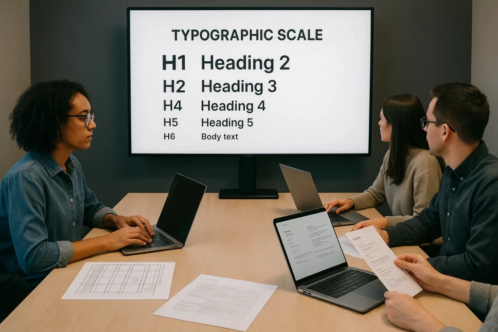
The 3 Levels of a Brand Typography Hierarchy
Understanding the three fundamental levels of brand typography hierarchy is like learning the grammar of a visual language. These levels—headlines, subheadings, and body text—serve as a structure that organizes content, creates visual rhythm, and guides readers through information with clarity and purpose.
Typography, in this context, isn’t just decoration—it’s information architecture in visual form.
Level 1: Headlines — Command Attention
Headlines are the loudest voice in your brand’s type system. Their purpose is to grab attention, establish mood, and introduce key messages at a glance. They are often the largest, boldest, and most stylized elements in a typography hierarchy.
A successful H1 or H2 in a digital brand setting must also be responsive—scaling well from desktop hero sections to mobile screens without losing visual impact or readability.
Case in point: Airbnb uses bold, soft-rounded sans-serifs for its headers, reinforcing its approachable, friendly tone. In contrast, a brand like Rolex might choose a high-contrast serif to evoke prestige and tradition.
Level 2: Subheadings — Build Context
Subheadings serve as navigational cues within content. They bridge the gap between primary headlines and the body copy, helping users skim for relevance and dive into sections that matter most to them.
These are often set in a smaller size than the headline, with moderate font weight, consistent letter spacing, and restrained styling. They may include semantic elements like font weight variation, typographic scale, or color to denote importance without overwhelming the design.
Customer Challenges addressed : “It’s hard to tell where one section ends and another begins.” Subheadings solve this problem by adding rhythm and visual segmentation to the page.
According to design studies by NNGroup, effective subheadings can improve content scanning speed by up to 47%, especially in dense digital formats like mobile UX.
Level 3: Body Text — Deliver the Message
Body text is where information lives. It’s the smallest and most restrained level of hierarchy, but arguably the most important. If your body font is unreadable—too light, too tight, or too fancy—you’ve already lost the user, no matter how beautiful your headers are.
Key considerations for body text include:
- Line height (leading): Should be at least 1.4x the font size.
- Optimal line length: Around 50–75 characters per line for best readability.
- Font choice: Prioritize highly legible fonts like Roboto, Source Sans, or Georgia depending on tone.
- Contrast: Ensure strong visual contrast between text and background (WCAG 2.1 recommends 4.5:1 ratio minimum).
Fun fact: In brand systems like IBM’s Carbon Design System, body text sizes are rigidly defined across a modular scale to ensure coherence across thousands of UI instances.
Bringing It Together as a System
When these three levels are designed in harmony, you create what’s called a typographic scale—a mathematical rhythm that unifies your brand’s textual elements. Whether you’re building a landing page, an ad, or a packaging label, a strong typography hierarchy ensures users always know what to read first—and what to remember.
Choosing the Right Fonts: Personality Meets Function
Choosing a font is not just an aesthetic decision—it’s a strategic one. The typefaces you choose define your brand’s personality and influence how users perceive your message. Whether your brand is bold and disruptive or calm and elegant, the right font communicates that at a glance.
But looks alone aren’t enough. Fonts must perform—they need to work across various screen sizes, languages, and platforms while staying legible and accessible. In this section, we’ll explore how to find the balance between personality and functionality in brand typography.
Fonts as Brand Storytellers
Fonts carry emotional weight. A serif font may communicate trust, heritage, and professionalism (think Merrill Lynch or The New York Times), while a geometric sans-serif like Futura evokes modernity and minimalism (e.g., Nike or Supreme).
The wrong choice? It can throw off your entire identity.
“Typography is the voice of the brand. Choose fonts the way you’d cast actors in a play.”
— Paula Scher, Partner at Pentagram
Evaluating Fonts for Performance
When evaluating font options, ask:
- Does it work well in various weights? (light, regular, bold)
- Is it legible at small sizes?
- Does it render well across browsers and devices?
- Does it have multilingual support or variable font capabilities?
- Does it scale appropriately for headings vs. body text?
According to Smashing Magazine, many designers regret using trendy fonts that look great in a logo but fall apart in body copy. Always test fonts in multiple use cases.
Common Font Roles in a Brand System
Here’s how roles typically break down:
- Display Font – Used for main headlines (H1-H2). Should be bold and distinctive.
- Supporting Font – Used for subheads, pull quotes, or accents.
- Body Font – Prioritizes readability, especially at smaller sizes.
- Code Font (if applicable) – For tech-focused brands, monospaced fonts may be used to evoke developer culture.
“Pairing a modern sans like Inter with a more classic serif like Charter gives you the best of both worlds—readability and character.”
Sourcing the Right Fonts (Free + Licensed)
Don’t just pick from your design software’s default list. Curated font libraries ensure better design systems.
Google Fonts: Open source, web-optimized
Adobe Fonts: Paid library with professional quality
Fontstand: Try-before-you-buy options
Typewolf: Great for inspiration and pairing ideas
Empathy for the End User
Users don’t “see” fonts consciously—but they feel them. Poor font choices lead to friction, fatigue, and higher bounce rates. For accessibility, aim for:
- x-height consistency
- clear letterforms (avoid ambiguous glyphs like lowercase “l” and “I”)
- WCAG compliance
Font Pairing Strategies for Hierarchy and Harmony
Typography is most effective when fonts don’t just coexist—they collaborate. A strong brand typography system relies on intentional font pairings that balance contrast with unity, and style with clarity. In this section, we’ll dive deep into the strategy behind combining typefaces to establish a visual hierarchy while maintaining harmony across all brand touchpoints.
When done well, font pairing amplifies messaging, guides attention, and strengthens your brand’s voice. Done poorly, it creates cognitive dissonance, visual noise, and weakens trust.
Why Font Pairing Matters
Every font has its own rhythm, personality, and design era. Pairing two typefaces—especially from different families—can introduce needed contrast, define separate content roles, and prevent monotony. But like mismatched musical notes, bad pairings jar the eye and hurt readability.
“The best font pairings behave like good design partners—they bring out the best in each other without competing for attention.” — Luke Wroblewski, Product Director at Google
Strategies for Successful Font Pairing
- Contrast with Restraint
- Use serif + sans-serif to create natural contrast (e.g., Playfair Display with Lato).
- Mix geometric and humanist styles for subtle complexity.
- Vary weight (e.g., bold header, light body) or case (uppercase title, sentence-case body).
- Complement, Don’t Compete
Choose fonts with complementary x-heights, line spacing, and stroke weight. Fonts from the same foundry often pair well because they were designed with visual harmony in mind. - Assign Roles Intentionally
- Headline fonts should command attention and express brand tone.
- Subheads can act as bridges using a variant or stylistic cousin.
- Body fonts must prioritize legibility over flair.
- Limit Your Palette
Two fonts is a good rule. Three, max—if you have a very clear rationale. More than that can feel messy and indecisive.
Examples of Proven Font Pairings
| Headline Font | Body Font | Brand Style |
| Montserrat | Lora | Bold + Elegant |
| Playfair Display | Source Sans Pro | Classic + Modern |
| Raleway | Roboto | Minimalist + Clean |
| Merriweather | Open Sans | Trustworthy + Friendly |
| Bebas Neue | Nunito | Energetic + Soft |
Common Mistakes to Avoid
- Too much contrast (e.g., decorative + script = chaos)
- Same classification without distinction (e.g., two similar sans-serifs that clash subtly)
- Ignoring line-height compatibility
- Using trendy fonts without considering long-term brand alignment
“Why does everyone pair Montserrat and Lora? Is that even good anymore?”
It’s a fair question—while popular combinations can be safe, the best ones feel tailored to your brand, not just convenient.
Testing Your Pairings
Don’t rely solely on aesthetics—test font pairs in actual use cases:
- Hero sections
- Email templates
- Mobile UI
- Print layouts
Use tools like Type wolf Pairings, Font Pair, and Font joy to experiment safely before embedding them into your system.
Accessibility in Typography: Readability for All Audiences
Design isn’t truly good unless it’s accessible. Typography plays a crucial role in digital inclusivity, ensuring all users—including those with visual or cognitive impairments—can comfortably navigate and understand content. In branding, accessible typography isn’t just ethical—it’s also legally and commercially smart.
This section will guide you through the principles, best practices, and standards to make your typography hierarchy accessible for every audience.
Why Typography Accessibility Matters
Approximately 1 in 5 people experience some form of visual disability. That includes color blindness, low vision, dyslexia, and aging-related conditions. Fonts that are too light, tightly spaced, or poorly contrasted hinder readability, especially on mobile devices.
According to the World Health Organization, over 2.2 billion people globally suffer from visual impairment. Accessible typography could be the difference between engagement and alienation.
Key Principles of Accessible Typography
- Contrast Is King
- WCAG 2.1 guidelines recommend a minimum contrast ratio of 4.5:1 for body text.
- Use WebAIM’s Contrast Checker to test font-color combinations.
- Font Size and Line Height
- Body text should be no smaller than 16px.
- Use line height of at least 1.5 for legibility, especially on mobile.
- Letter and Word Spacing
- Maintain consistent tracking.
- For all-caps headlines, increase letter-spacing slightly for clarity.
- Avoid Decorative Fonts for Body Text
- Scripts, calligraphy, and ultra-light fonts decrease readability.
- Use familiar typefaces like Open Sans, Roboto, or Georgia for paragraph content.
- Readable Line Length
- 50–75 characters per line is optimal.
- Too long = eye fatigue. Too short = disruptive reading flow.
- Font Weight
- Use 400 (Regular) or 500 (Medium) for body text.
- Avoid ultra-light or thin weights for any primary content.
Designing for Neurodiversity
Accessible typography also supports people with dyslexia, ADHD, and autism:
- Use left-aligned, ragged-right text for consistent reading flow.
- Avoid justified text—it creates uneven word spacing.
- Use sans-serif fonts for higher legibility (like Lexend, which was designed specifically for dyslexia support).
“For people with dyslexia, the right font makes all the difference,” notes Dr. Luz Rello, founder of accessibility nonprofit ChangeDyslexia.
Legal and SEO Benefits
Ignoring accessibility can expose your brand to lawsuits under ADA and EU accessibility regulations. From a business standpoint, accessible design:
- Expands your user base
- Reduces bounce rates
- Boosts SEO through structured headings and readable layouts
Customer Challenges : “We want to be inclusive, but don’t know where to start.”
Accessible typography is one of the lowest-lift, highest-impact places to begin.
Tools and Resources
- WebAIM – Testing tools for contrast, screen reader behavior
- Google Lighthouse – Audits accessibility as part of SEO health
- Inclusive Components – Guides for building readable UI elements
Brand Examples Leading in Typography Accessibility
- BBC GEL: Implements strict font sizes and contrast in all digital products.
- Microsoft Fluent: Uses variable font weights and dynamic scaling across apps.
- Apple: Offers system-wide text scaling and VoiceOver testing for all typography.
Typography Hierarchy in Action: Case Studies
Theory becomes reality when you see typography hierarchy applied in real-world brand systems. In this section, we’ll analyze how top brands structure their type to establish clarity, consistency, and character—proving that fonts aren’t just design choices but strategic brand tools.
Each of these examples showcases how thoughtful type hierarchy enhances user experience and reinforces brand voice.
Airbnb: Warm, Friendly, and Accessible
Airbnb’s branding is rooted in friendliness and belonging. Its typography reflects this by using:
- Headline Font: Circular—a geometric sans-serif with soft curves
- Body Font: Custom type based on Circular, adapted for screens
- Hierarchy: Clean, generous spacing with clear typographic levels
Airbnb pairs bold H1s with ample white space, creating a calm experience. Subheads are medium-weight and body text is extremely readable across devices.
Observation: Airbnb’s type hierarchy promotes a “calm scroll,” encouraging users to explore listings with comfort rather than urgency.
IBM: Functional, Modular, and Authoritative
IBM’s Carbon Design System sets the gold standard in enterprise UI typography. Its system features:
- Font: IBM Plex (custom family with serif, sans-serif, mono)
- Typographic Scale: Built on an 8px grid with strict spacing tokens
- Usage: Headers in Plex Sans Bold, body text in Regular with 1.5 line height
The brand achieves clarity in complex interfaces—dashboards, tables, forms—by aligning all text to a modular baseline and enforcing predictable scaling.
Customer Challenges addressed: “How do I build a type system that works across hundreds of interfaces?”
Spotify: Expressive, Modern, and Bold
Spotify’s identity thrives on rhythm and energy, and its typography echoes that. The hierarchy often includes:
- Headline Font: Circular or Spotify Circular
- Subheads: Slightly lighter weights, same family
- Body: Minimalist and center-aligned in many campaigns
Spotify pushes traditional hierarchy with kinetic typography in motion ads and animated type that pulses with the beat—blending content and experience.
“I don’t even like Spotify’s music recommendations, but damn, their typography makes me feel like they get me.”
Mailchimp: Whimsical Meets Pragmatic
Mailchimp’s brand voice is quirky and conversational. They use Cooper Light for big headlines and Graphik for functional content, creating a balance of playfulness and legibility.
- Use Case: Emails, help docs, onboarding flows
- Hierarchy: Headlines are loud and warm, while body text remains neutral
Mailchimp’s case shows how mixing expressive headers with practical body fonts supports a complex brand personality without losing clarity.
What You Can Learn from These Brands
- Adapt Your Fonts to Context: Headlines aren’t just for homepages—use different hierarchies in email, mobile, and print.
- Custom Fonts ≠ Complex: Even custom typefaces can follow simple, scalable principles.
- Balance Expression with Function: Bold doesn’t mean chaotic; even creative brands follow a disciplined typographic structure.
Common Typography Mistakes to Avoid
Even the most thoughtfully chosen fonts can fall flat when typography hierarchy is mishandled. Whether it’s inconsistency, poor readability, or a complete lack of structure, these mistakes can dilute your brand’s message and alienate your audience. In this section, we’ll spotlight common pitfalls and how to avoid them when building your brand’s typographic system.
1. Inconsistent Hierarchy Across Assets
A common branding misstep is treating typography differently in every touchpoint—website, email, packaging, app. This erodes recognition and trust.
Symptom: Different font sizes, weights, or line spacing used for the same content types (e.g., body text in 14px on web, 12px on mobile app).
Fix: Create a universal type system with scalable rules. Use design tokens to lock font sizes, line heights, and spacing into your design system.
According to UX Collective, inconsistent type costs up to 35% more in development time due to avoidable overrides and QA issues.
2. Using Too Many Fonts
Just because you can use multiple fonts doesn’t mean you should. More than two or three typefaces often leads to visual clutter and conflicting personalities.
“Client wants 5 fonts on one business card… what do I do?”
Most responses: “Say no.”
Best Practice: Stick to one primary font family with a few weights and one secondary for contrast.
3. Ignoring Line Length and Spacing
Typography fails when it’s hard to read—period.
- Line lengths over 80 characters create fatigue.
- Line spacing that’s too tight or too loose affects rhythm.
- Inconsistent margins or padding make layouts feel unbalanced.
Customer Challenges : “Our pages feel heavy and hard to read.”
This usually stems from ignoring typographic rhythm and grid structure.
4. Inappropriate Font for the Brand
The wrong font tone sends the wrong message. A bank using Comic Sans or a law firm using Brush Script undermines credibility.
Fix: Always evaluate fonts on tone, purpose, and performance. Conduct A/B tests with real users before making final decisions.
Imaginary anecdote: One nonprofit tried a hand-drawn font to appear “human.” Their donation page tanked until they switched to a clean sans-serif—donations jumped 18% due to improved trust.
5. Relying on Trends Over Function
Trendy fonts (ultra-condensed sans-serifs, elaborate serifs) can look modern now but may age poorly or sacrifice readability.
Rule of Thumb: Favor timeless over trendy for primary text. Use expressive fonts sparingly and only where supported by hierarchy.
6. Failing Accessibility Standards
- Light gray text on white background?
- Body font below 14px?
- Overuse of all caps?
These common design choices violate WCAG guidelines and alienate users, especially those with visual impairments.
Fix: Always test for contrast, scale, and readability. Use accessibility tools during design—not just as an afterthought.
7. No Clear Role Assignment
When fonts aren’t assigned consistent roles (e.g., “This is our H1 style,” “This is for buttons”), the system breaks under pressure.
Example of poor practice: Using the same size and weight for H3 and body text. Users won’t know what’s important.
Best Practice: Define style tokens for each heading and paragraph type. Stick to them.
Creating a Scalable Typography System
As brands grow, so do their design needs—across websites, apps, email campaigns, packaging, and even billboards. Without a scalable typography system, your brand’s visual consistency quickly breaks down. This section outlines how to build a typography hierarchy that scales across mediums, teams, and technologies.
Think of it as setting the architectural blueprint for all brand communication—strong, flexible, and future-proof.
What Is a Scalable Typography System?
A scalable system is one that:
- Adapts across platforms (web, print, mobile)
- Supports multi-language typography
- Is built on design tokens and modular scales
- Can be used by both designers and developers with minimal guesswork
“Typography systems should scale like code libraries—reusable, predictable, and built for change.”
— Brad Frost, creator of Atomic Design
Foundation: Type Tokens and Rules
Start by defining type tokens (the foundational styles of your type system), such as:
h1-font-size,h1-line-height,h1-font-weightbody-font-size,body-line-heightcaption-color,caption-letterspacing
Tokens make it easy to update type globally and enforce brand consistency through code.
Responsive Typography and Breakpoints
Your typography must scale across:
- Small screens (phones)
- Medium screens (tablets)
- Large screens (desktops)
- Extra-large displays (TVs, billboards)
Use fluid type scales with CSS clamp(), REM units, and media queries to keep type responsive. This prevents header overflow or tiny mobile text—two major pain points for brands.
Multilingual Typography Support
If your brand is global, your type system must:
- Support non-Latin scripts (Arabic, Japanese, Devanagari)
- Handle variable word lengths
- Use fonts with wide language support (e.g., Noto Sans, Inter, IBM Plex)
Case in point: Google’s Material Design guidelines recommend pairing Roboto with Noto for global accessibility.
Systematizing Type Roles
Define your roles clearly
- Display: Hero banners, splash screens
- Heading 1–6: Pages and components
- Body (L, M, S): Paragraphs, tooltips, footnotes
- UI text: Buttons, inputs, labels
Every role should come with a usage rule, example, and do/don’t. For example
- Use H2 for section titles—not for emphasized body text.
- Don’t use body-small in hero banners—it’s unreadable on mobile.
Bridging Design and Development
Your typography system should be documented in both your:
- Design tool (Figma, Sketch, Adobe XD)
- Codebase (Style Dictionary, Tailwind, CSS-in-JS, etc.)
Create tokens, then sync them across environments using tools like
- Figma Tokens plugin
- Style Dictionary
- Design System APIs
Customer Challenges addressed: “Our developers implement fonts differently than what we design.”
Solution: codify your typography with design tokens, version control, and clear naming.
Future-Proofing Your Typography
- Embrace variable fonts for dynamic scaling with fewer file loads
- Define fallback fonts to preserve hierarchy when custom fonts fail
- Version your type system just like code—track changes and get feedback
FAQ
1. How do I choose the right font for my brand?
Start by identifying your brand personality. Is it elegant, bold, modern, or traditional? Fonts should reflect these traits. Choose a primary font that supports readability and emotional tone (e.g., a soft sans-serif for warmth, a serif for heritage). Then, test your selections across mediums—website, social media, print—to ensure they scale well and align with your voice.
2. What’s the best font hierarchy for websites and mobile apps?
A simple, scalable hierarchy is ideal:
- H1: 36–48px (bold and attention-grabbing)
- H2: 24–32px
- H3: 18–24px
- Body: 16px minimum
- Caption: 12–14px
Use a consistent modular scale (e.g., 1.25) and ensure all text meets WCAG contrast ratios. Use Utopia to generate responsive typography that works on every screen size.
3. How many fonts should a brand use?
Two is the sweet spot
- Primary font: For headings and body
- Accent font (optional): For decorative use or contrast
Too many fonts create clutter. Instead, use font weights and styles (italic, medium, bold) within one font family to build hierarchy.
4. What are some accessible fonts for body text?
Accessible fonts include
- Roboto
- Open Sans
- Lexend (especially for dyslexia support)
- Georgia (for a classic serif option)
Prioritize fonts with clear letterforms, open apertures, and high x-height. Avoid thin, ultra-condensed, or overly decorative fonts for paragraphs.
5. Why does my typography look different on mobile vs. desktop?
Mobile screens compress line length and space, making poor hierarchy even more obvious. If your typography isn’t built with responsive scaling, it may break on smaller devices. Use relative units like rem, em, or vw, and define breakpoints for type behavior in your CSS or design system.
Conclusion
Typography is more than visual polish—it’s the infrastructure of brand communication. A strategic, scalable typography hierarchy allows your brand to speak consistently, clearly, and inclusively across every touchpoint. From the size of your H1s to the rhythm of your line heights, every detail shapes how users feel, read, and remember your brand.
The key to success? Build a system, not just a style. Use modular scales to establish rhythm, assign roles to every font, prioritize accessibility, and let your visual language evolve with your audience. When typography is done right, it becomes invisible—and what remains is a seamless, memorable brand experience.